
Next.js Route Navigation Progress Bar: Enhancing User Experience with BProgress

· 5 min read
Kaypen
Frontend Developer

This tutorial is also available as a video on YouTube 👉 【Next.js】Route Navigation Progress Bar

Hello, I'm Kaypen.

Let's start with a bad example.

In Dify.ai, when you click to navigate to another page, there's a waiting period before the page actually transitions.

Dify.ai lacks progress feedback during page navigation

However, during this waiting time, I don't know whether the navigation was successful or not, so I end up clicking multiple times until the page finally changes.

This is a poor user experience 👎

The solution is simple. Let's look at how GitHub handles navigation interactions.

GitHub's progress bar effect during page navigation

As you can see, GitHub displays a progress bar during navigation, clearly telling users - "I'm navigating, please wait."

So how can we implement this effect in Next.js?

We can achieve this using the BProgress library.

BProgress official website homepage

BProgress is a lightweight progress bar component library that supports Next.js 15+, as well as other frameworks like Remix and Vue.

For using BProgress, I've created a demo project nextjs-progress-bar-demo. Let's clone this project first:

git clone git@github.com:wukaipeng-dev/nextjs-progress-bar-demo.git

Then enter the project directory:

cd nextjs-progress-bar-demo

First, install the dependencies:

npm install @bprogress/next

Start the project:

npm run dev

Next.js progress bar demo project interface

As you can see, this is a simple Next.js project with three pages: Home, Login, and Register.

The main branch already has the progress bar configured. Let's switch to the without-progress-bar-demo branch:

git checkout without-progress-bar-demo

In this branch, we haven't configured the progress bar, so no progress bar will be displayed during page navigation.

Next, let's import ProgressProvider in the root layout app/layout.tsx:

'use client';

import "./globals.css";
import { ProgressProvider } from '@bprogress/next/app';

export default function RootLayout({
children,
}: Readonly<{
children: React.ReactNode;
}>) {
return (
<html lang="en">
<body>
<ProgressProvider
height="4px"
color="#4c3aed"
options={{ showSpinner: false }}
shallowRouting
>
{children}
</ProgressProvider>
</body>
</html>
);
}

Now, we can see that when navigating between the home page and login page, or between login and register pages, a progress bar will be displayed.

Page navigation effect after integrating BProgress

The ProgressProvider parameters are:

  • height: The height of the progress bar
  • color: The color of the progress bar
  • options: Progress bar configuration. Here showSpinner is set to false, meaning no animated loading icon will be displayed.
  • shallowRouting: Whether to enable shallow routing. If enabled, when only the route's query parameters change (e.g., ?page=1 to ?page=2), the progress bar won't reload.

However, after successful login, clicking to navigate won't show the progress bar.

Progress bar not showing when using router.push

This is because navigation between the home page and login page, or between login and register pages, uses the <Link> component.

The <Link> component actually renders as an <a> tag, and BProgress adds click events to all <a> components to show the progress bar.

We can check in DevTools → Elements → <a> → Event Listeners whether a click event has been added:

Viewing Link component's click event listeners in DevTools

But after successful login, we use router.push for navigation.

BProgress doesn't add click events to router.push, so naturally it won't show a progress bar.

Don't worry, BProgress provides us with a useRouter method.

Replace Next.js's useRouter with the useRouter provided by BProgress:

// import { useRouter } from 'next/navigation';
import { useRouter } from '@bprogress/next/app';

Then use it as normal:

const router = useRouter();

router.push('/');

Now you can see that after successful login, when automatically navigating to the home page, the progress bar displays correctly.

Progress bar displays correctly after using BProgress's useRouter

But if your project has already wrapped its own useRouter, you can pass the wrapped useRouter as a parameter customRouter for a second wrapping:

import { useRouter } from '@bprogress/next/app';
import { useRouter as useNextIntlRouter } from '@/i18n/navigation';

export default function Home() {
const router = useRouter({
customRouter: useNextIntlRouter,
});

return (
<button
onClick={() =>
router.push('/about', {
startPosition: 0.3,
locale: 'en',
})
}
>
Go to about page
</button>
);
}

Finally, let's go back to app/layout.tsx, where we imported ProgressProvider but turned app/layout into a client component. Let's extract ProgressProvider elsewhere and keep app/layout as a server component.

// app/components/ProgressWrapper.tsx
'use client';

import { ProgressProvider } from '@bprogress/next/app';

interface ProgressWrapperProps {
children: React.ReactNode;
}

export function ProgressWrapper({ children }: ProgressWrapperProps) {
return (
<ProgressProvider
height="4px"
color="#0000ff"
options={{ showSpinner: false }}
shallowRouting
>
{children}
</ProgressProvider>
);
}

In app/layout.tsx, we import ProgressWrapper:

import { ProgressWrapper } from './components/ProgressWrapper';

export default function RootLayout({
children,
}: Readonly<{
children: React.ReactNode;
}>) {
return (
<html lang="en">
<body>
<ProgressWrapper>
{children}
</ProgressWrapper>
</body>
</html>
);
}

Great job! You've completed the integration of a route navigation progress bar in Next.js.

That's all for this tutorial. I hope you found it helpful.

Thanks for reading! 👏

Who Can Tell the Difference Between Next.js, Nest.js, and Nuxt.js?

· 2 min read

As a frontend developer, at least once in your career or studies, you'll encounter a situation where you need to distinguish between Next.js, Nest.js, and Nuxt.js.

I just had one of these moments recently.

A new colleague joined our company, and during lunch chat, I heard him mention he had worked on Next.js projects before.

Since our company's new project is based on Next.js, I thought, "Great! Our new project is saved!"

But later in the group chat, he clarified that he had actually worked on Nest.js projects.

That really threw me off.

As an ordinary developer speaking ordinary Mandarin, it's completely normal not to be able to distinguish between the pronunciations of Next /nekst/ and Nest /nest/.

The authors who named these frameworks were really "clever."

These names are like wholesale products - all following the pattern N__t.js. The last time I was this confused was with the jewelry brands "Chow Tai Fook, Chow Luk Fook, Chow Sang Sang, Luk Fook Jewellery..."

This brand piggybacking actually peaked around 2016 when frontend frameworks were exploding.

That was a time when the frontend industry was blooming with various frameworks emerging constantly.

On October 25, 2016, Next.js 1.0 was released, making its debut as an open-source project.

Next.js is based on the React framework, providing Server-Side Rendering (SSR) and Static Site Generation (SSG) capabilities, along with features like automatic code splitting and routing systems.

Just one day later, on October 26, Nuxt.js was released.

I have to say, Nuxt.js copied really fast - it's based on Vue.js and created another version of Next.js.

Nest.js came later, releasing on February 26, 2017. It's quite different from Next.js and Nuxt.js.

It's a pure Node.js backend framework - essentially the JavaScript world's Spring Boot.

All three frameworks are doing well now. Besides their own technical merits, could their success be partly due to their "trend-riding" names?

Maybe next time when developing a new framework, we should just call it Not.js.

The Best Node.js Version Manager, Even Better Than NVM

· 3 min read

Introduction to Volta

When we first started installing Node.js, we could only download the installation package from the official website to install a specific version, like 18.17.1.

But for different projects, we might need different Node.js versions, like 18.17.1 and 20.17.1.

To switch versions, you'd need to uninstall the old version, install the new one, then switch projects - extremely troublesome (pain mask).

So Node.js version managers emerged, like NVM, Volta, etc.

They support installing specific Node.js versions and allow free switching between versions.

However, NVM has some issues. For example, it can't automatically switch versions based on projects, doesn't support Windows platform (though there's an unofficial nvm-windows that works), etc.

The new generation Node.js version manager Volta solves these problems.

It can automatically switch Node.js versions based on projects and supports Mac, Windows, and Linux platforms.

Volta is built with Rust, making it faster and better.

Installing Volta

According to the installation guide, enter the following command in your terminal to install Volta:

curl -fsSL https://get.volta.sh | bash

After installation, open a new terminal and enter the following command to check the current Volta version:

volta -v
2.0.2

Congratulations, Volta is successfully installed!

Now we can use Volta to manage Node.js versions.

Enter the following command in the terminal to install Node.js:

volta install node

This command will install the latest LTS version of Node.js.

LTS: Long Term Support version.

Of course, you can also use the at symbol @ to install a specific Node.js version, for example:

volta install node@20.17.1

Project-Level Node.js Version Management

Open a Node.js project you're maintaining, like "shit-mountain", find the package.json file, and add the following content:

{
//...
"volta": {
"node": "20.17.1"
}
}

When you run npm i, Volta will look for Node.js version 20.17.1.

If it can't find it, Volta will automatically install Node.js 20.17.1, then execute npm i.

This ensures the project uses Node.js version 20.17.1.

Volta has other features, like various Volta commands - list, uninstall, etc., as well as Hooks that can specify download sources. I won't elaborate here.

Visit the Volta website for more information 👉 https://volta.sh

How to Make Your Open Source Project More Attractive? Try Adding Vercel One-Click Deploy

· 3 min read

In some well-known GitHub open source projects, you'll find support for Vercel one-click deployment. For example, NextChat, which exploded in popularity two years ago and now has 78.7k stars:

So what is Vercel? It's a modern deployment platform designed specifically for frontend developers, particularly suitable for building, previewing, and deploying static websites and frontend applications.

So, if your open source project is a static website or frontend application, consider adding Vercel one-click deploy to your README.md to increase your project's attractiveness.

Adding one-click deployment is quite simple. Vercel provides a button generator tool: deploy-button

The button generator creates three formats: Markdown, HTML, and URL - you can choose what you need.

Just a heads up, the interaction here might feel a bit odd. The form input is at the bottom of the page. For example, after filling in the Git repository URL, the Markdown link above will automatically change without any success notification. You'll need to get used to this.

The only required field is your Git repository URL:

Other options include environment variables, default project name, redirects, demos, integrations, etc. Fill these as needed, then paste the generated Markdown into your open source project's README.md:

That's the entire process - very simple!

From the user's perspective, when they click the deploy button, they'll be redirected to the Vercel website:

Users need to log in to Vercel, and Vercel will request read/write permissions for Git repositories because Vercel needs to clone the target repository and deploy based on the cloned repository.

Fill in the project name and click create:

Then just wait for completion:

Congratulations!

You can already see the preview screenshot of the successfully running website. You can also click "Continue to Dashboard" to go to the control panel, then click the domain URL to see that the website has been successfully deployed:

Looking back at the whole process, Vercel's deployment service is incredibly smooth. I didn't even need to provide framework information, run commands, etc.

So, if you think Vercel one-click deployment is a good idea, consider adding it to your project!

If needed, you can check out the example project from this article: https://github.com/wukaipeng-dev/ken

After a Year of Heavy Use, How I Pushed TickTick to Its Limits

· 6 min read

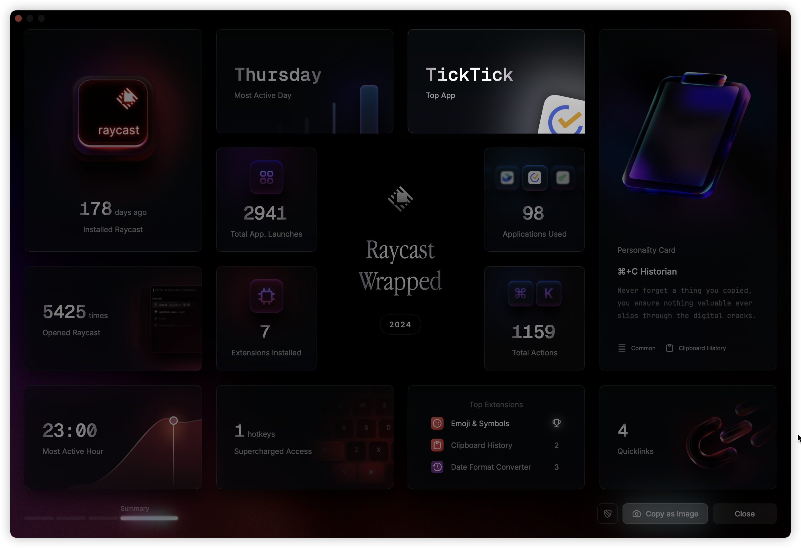
Raycast's 2024 annual statistics are out. These stats include how many times I used Raycast to open other apps throughout the year. Seeing TickTick opened over a thousand times, ranking first, was a bit surprising.

TickTick's Chinese name: 滴答清单

This year was my first year trying and gradually becoming a heavy user of TickTick. Initially, I just wanted to find a task management software. After comparing many other todo apps, TickTick's free version is what I personally consider the most generous - covering most features.

While the free aspect was tempting, it wasn't enough to win me over. What really convinced me was how it solved my long-standing pain points.

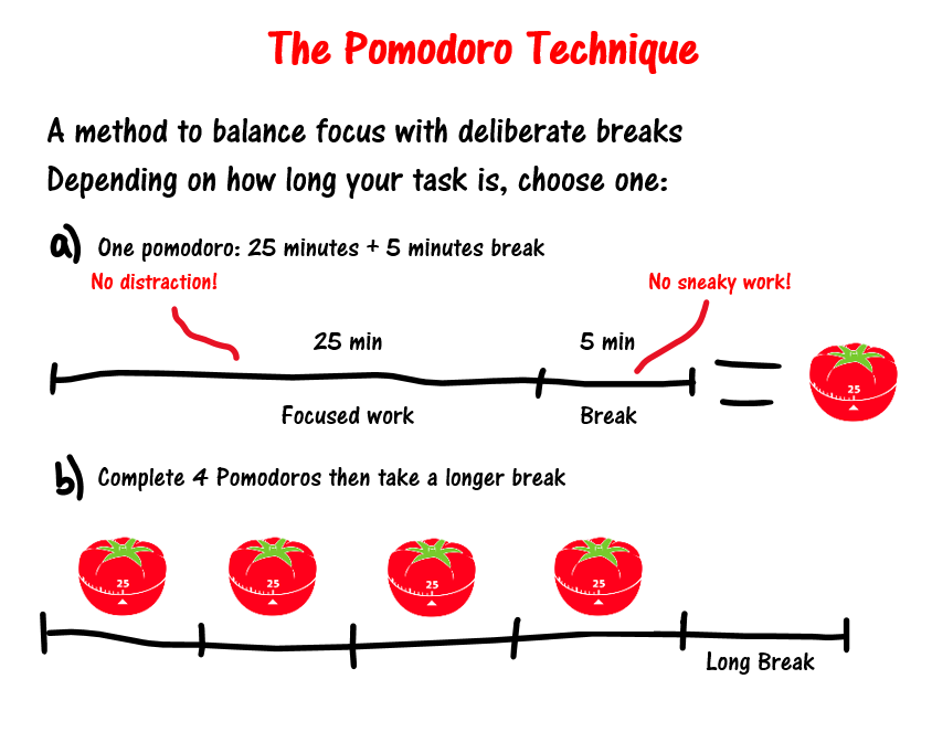
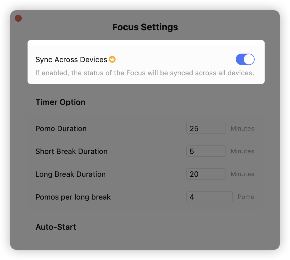
When working on tasks, I use the Pomodoro Technique, which means focusing for 25 minutes (1 Pomodoro), then taking a 5-minute short break, and after accumulating 4 Pomodoros, taking a long break - this cyclical rhythm for focus.

Previously, I bought a desktop timer clock. Students preparing for exams should be familiar with this - something like this:

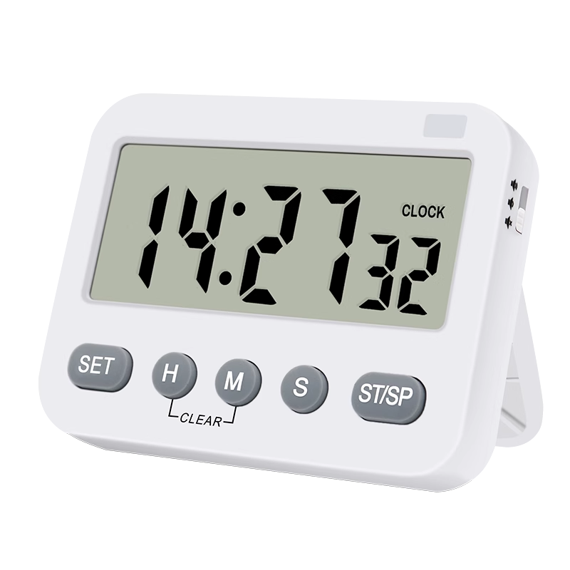
This timer can count up or count down, perfect for a 25-minute Pomodoro countdown. I used this for over 2 years, buying one for home and another for the office.

It's convenient - physical buttons, one press to start a Pomodoro. But its advantage is also its disadvantage.

Physical limitations mean I can't carry a timer everywhere. More troublesome, at the end of the day, I don't know how many Pomodoros I spent, when I started them, or what tasks I worked on during each Pomodoro.

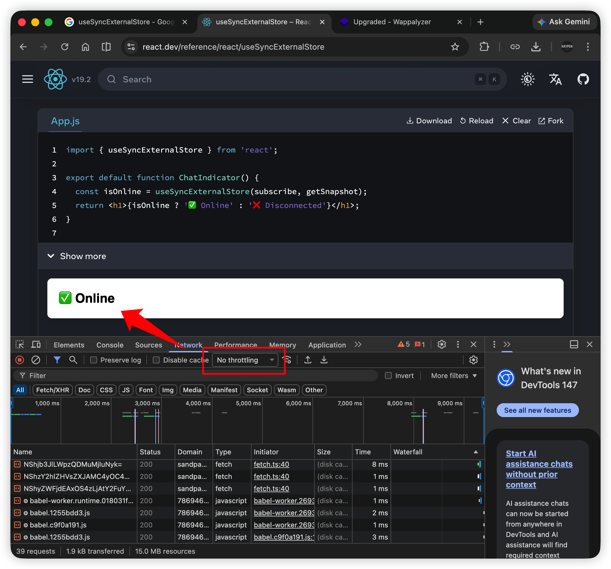
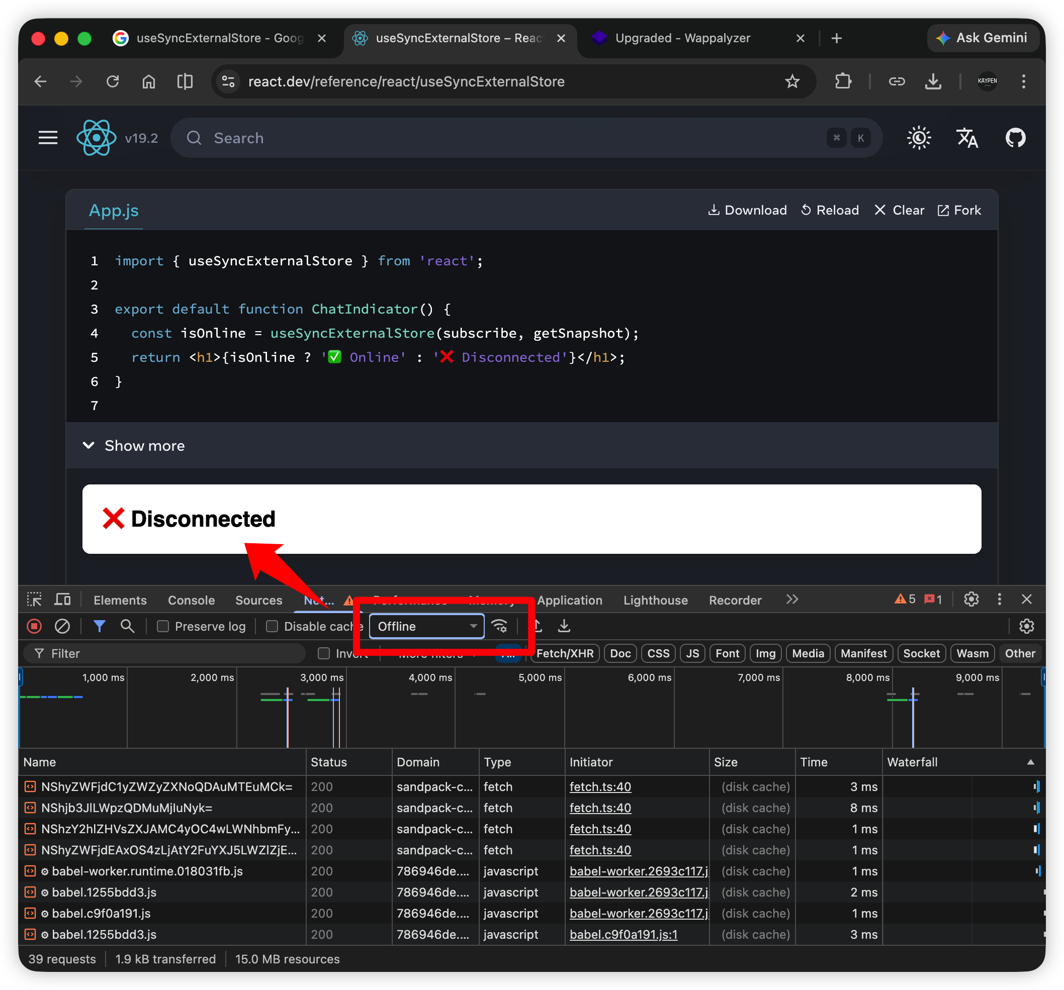
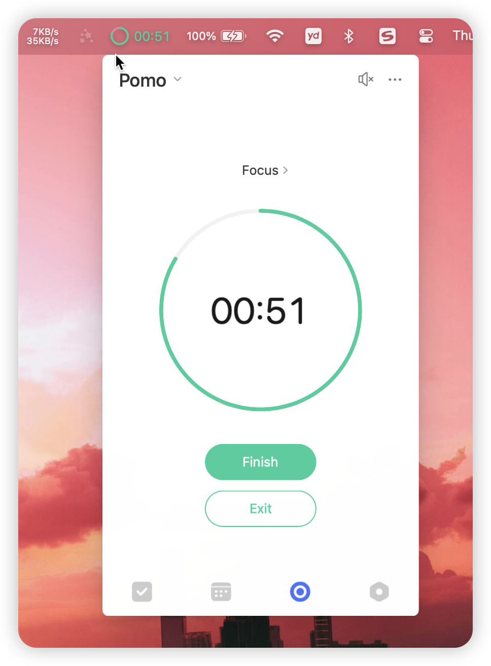
In TickTick, after adding a task, you can directly start a Pomodoro for that task, or associate tasks with ongoing Pomodoros, while adding notes. Opening the statistics page clearly shows the start and end of each Pomodoro.

This basically solved my major pain point. Another minor itch was its notification feature. I often forget to start Pomodoros, but TickTick shows focus progress explicitly in the computer's menu bar:

If cross-device sync is enabled, both phone and computer will sync current focus progress in real-time:

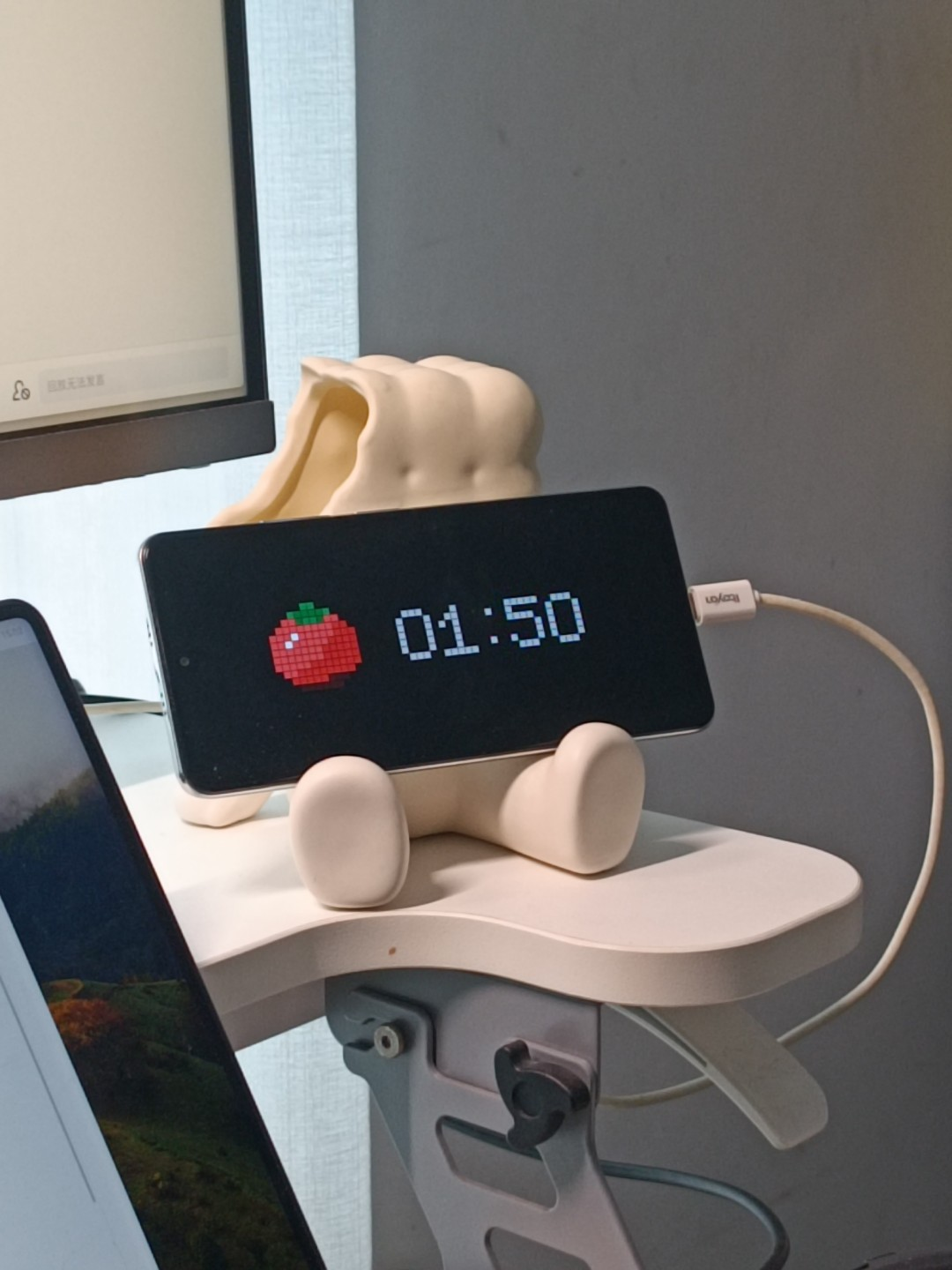
What pleasantly surprised me was that after enabling focus mode on mobile, it automatically enters immersive mode. Besides the flip clock mode, there's this pixel mode with particularly beautiful UI:

After TickTick solved my Big Trouble, I started exploring other features.

For the core function - task management, the first point is task categorization. I believe many people's categories are quite messy, adding a "Reading" category today, a "Project Management" category tomorrow. Once categories multiply, they become hard to manage.

Here I recommend a very practical categorization method: categorizing by "roles"

At work, the role is "Employee"; at school, it's "Student"; on the track, it's "Athlete". In any social relationship, everyone plays different roles.

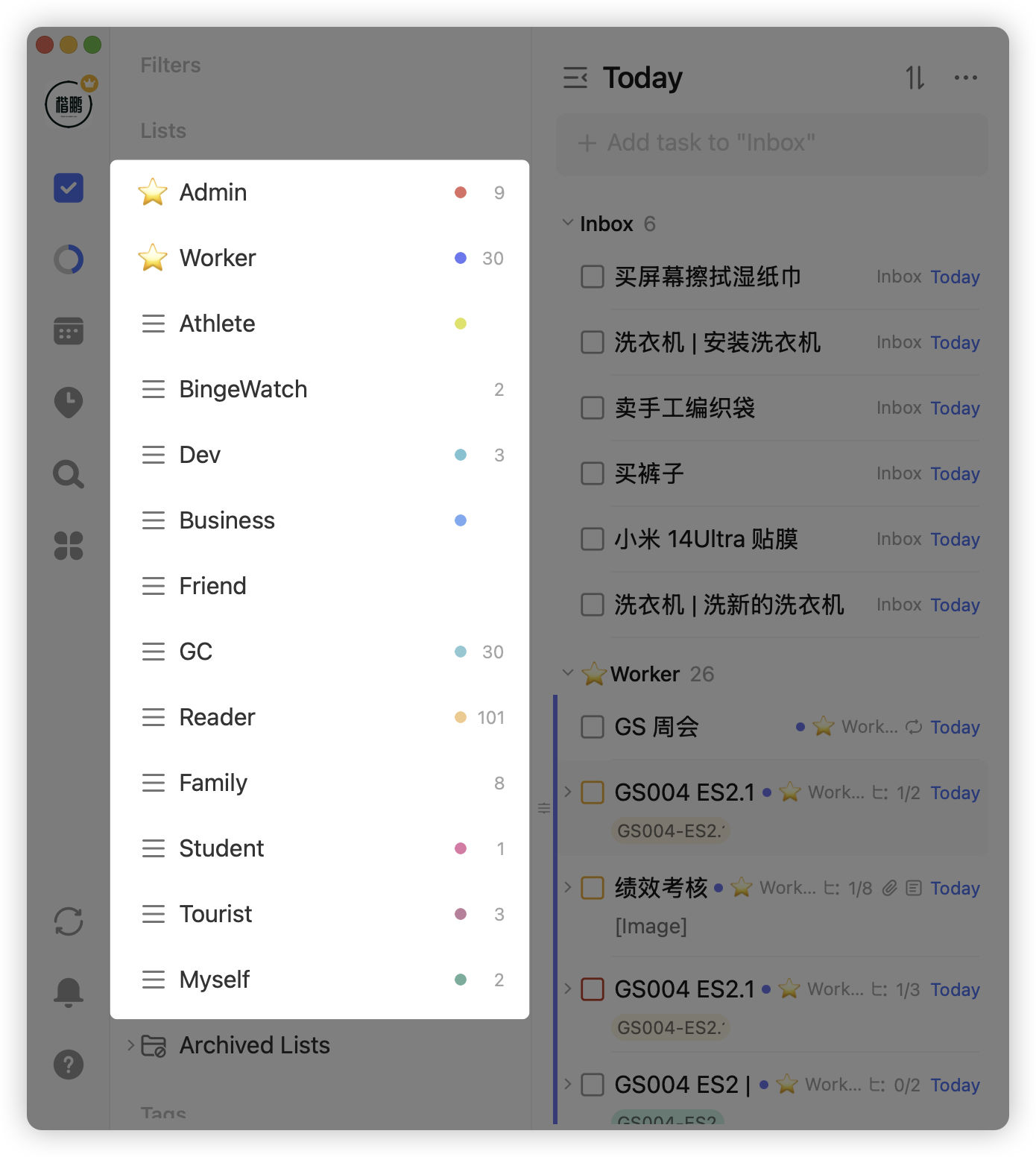
In my personal TickTick categories, I have roles like Admin, Worker, Developer, Friend, Reader, etc.

This division method is very stable. Once my task categories were divided, there were almost no major changes. It's also flexible enough - for example, if you become a father, just add a "Father" role, and tasks like buying formula and changing diapers go under this role.

Categorizing by roles covers almost everything, but some roles need horizontal expansion. For instance, as an employee, you need to work on project a, project b, project c, etc. You can use tags to label tasks accordingly, distinguishing different task types under roles:

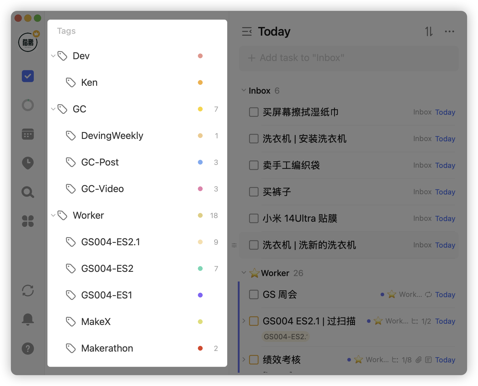
Through role division + tag system, you can basically establish an orderly and stable categorization system.

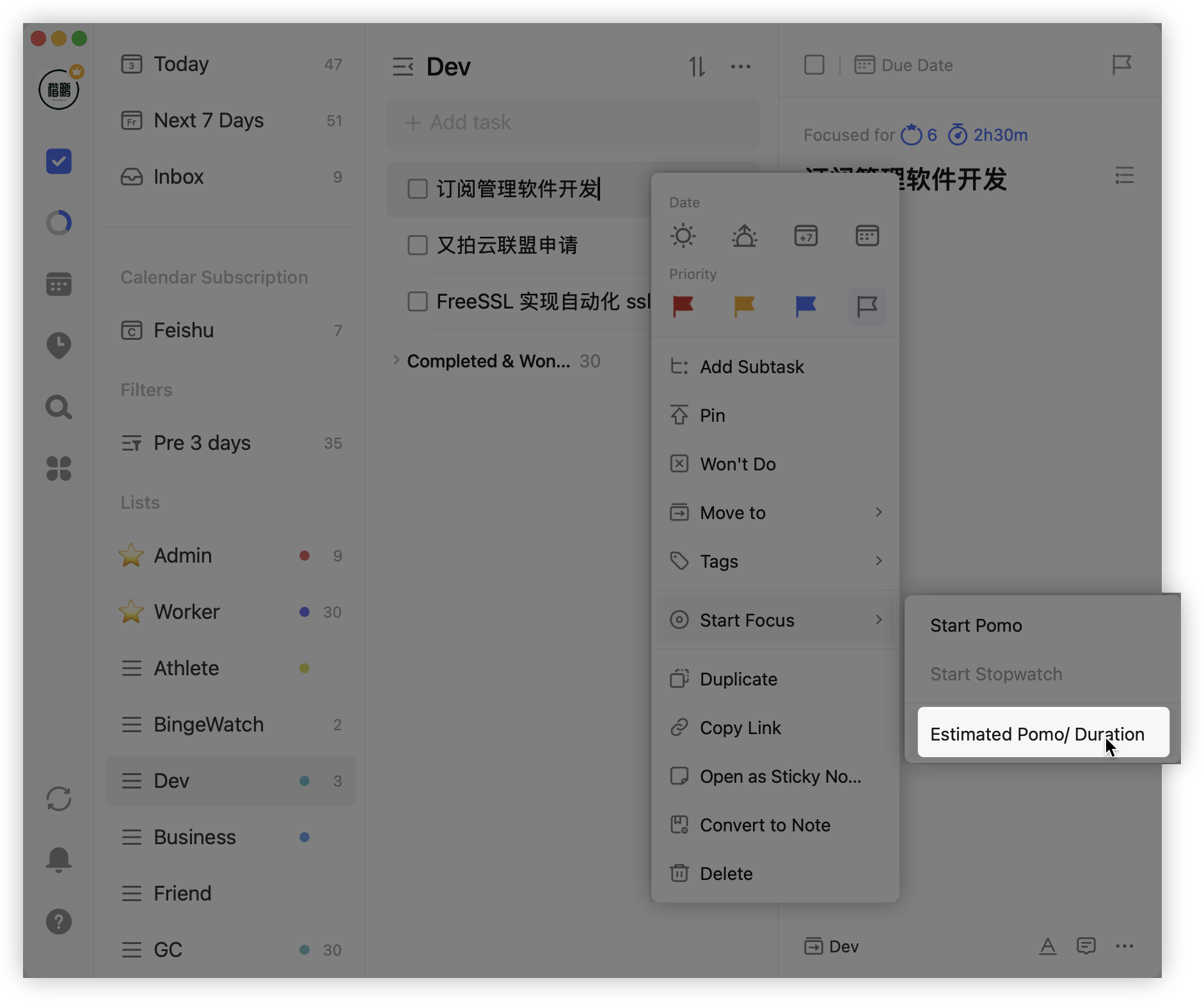
The second point is task processing. TickTick hides many thoughtful features, like setting the estimated number of Pomodoros for a task:

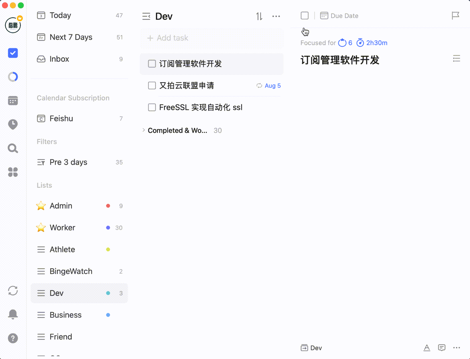
Or setting task progress percentage:

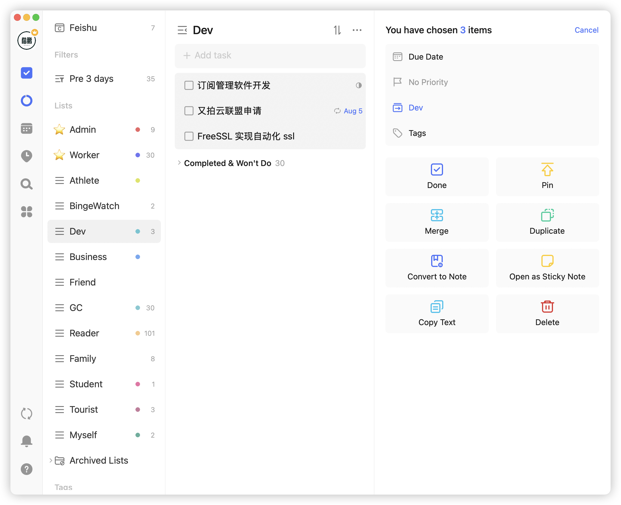
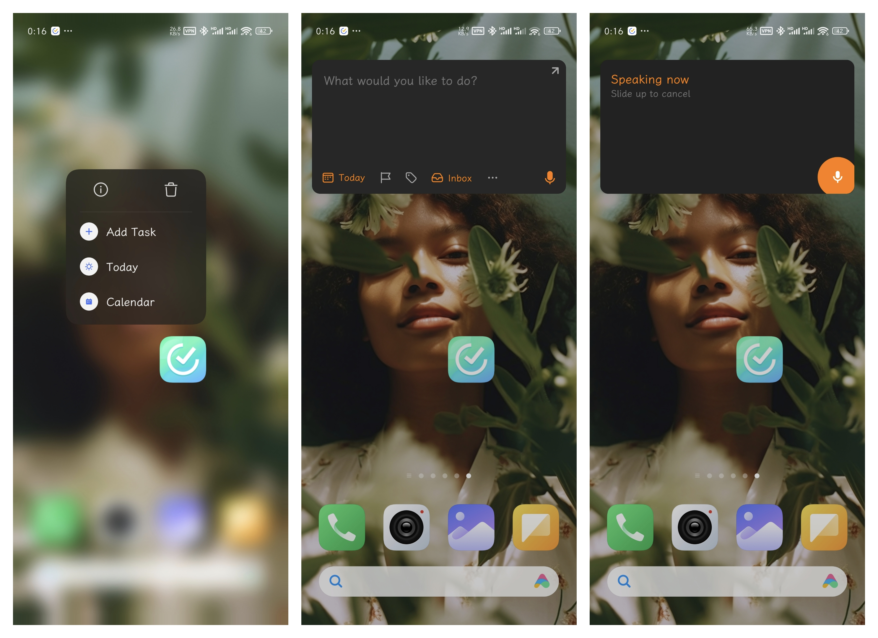
After selecting multiple tasks by holding Shift or Command/Control, you can batch process them:

On mobile, long-press the app icon to add tasks. The task box has a voice-to-text function in the lower right corner to speed up task addition:

Another feature is the calendar. I didn't have the habit of using it before, but recently discovered two points that made me realize calendars are amazing.

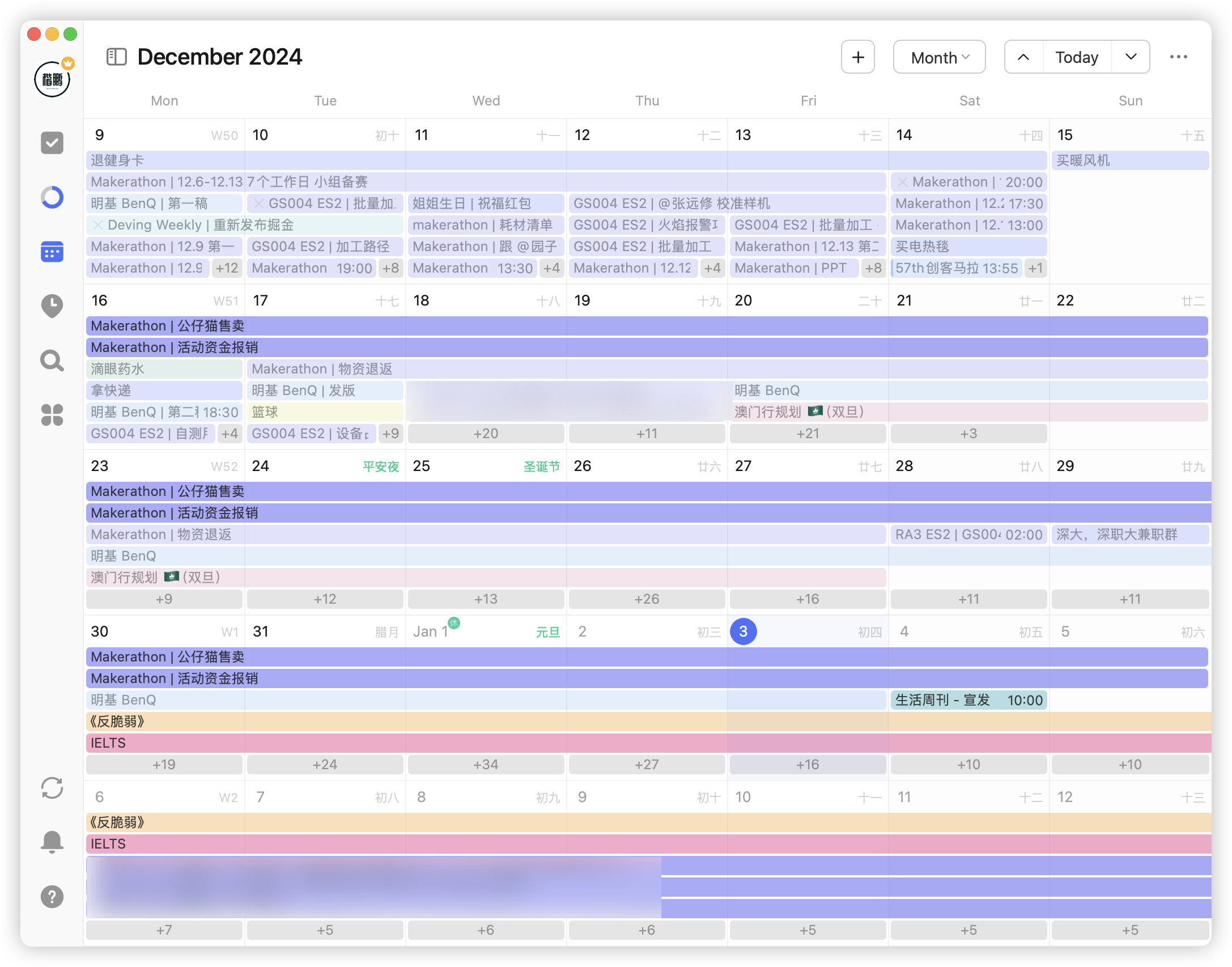
First discovery: you can use filter panels to view target tasks. Previously without filters, seeing all tasks piled together on the calendar gave me a headache:

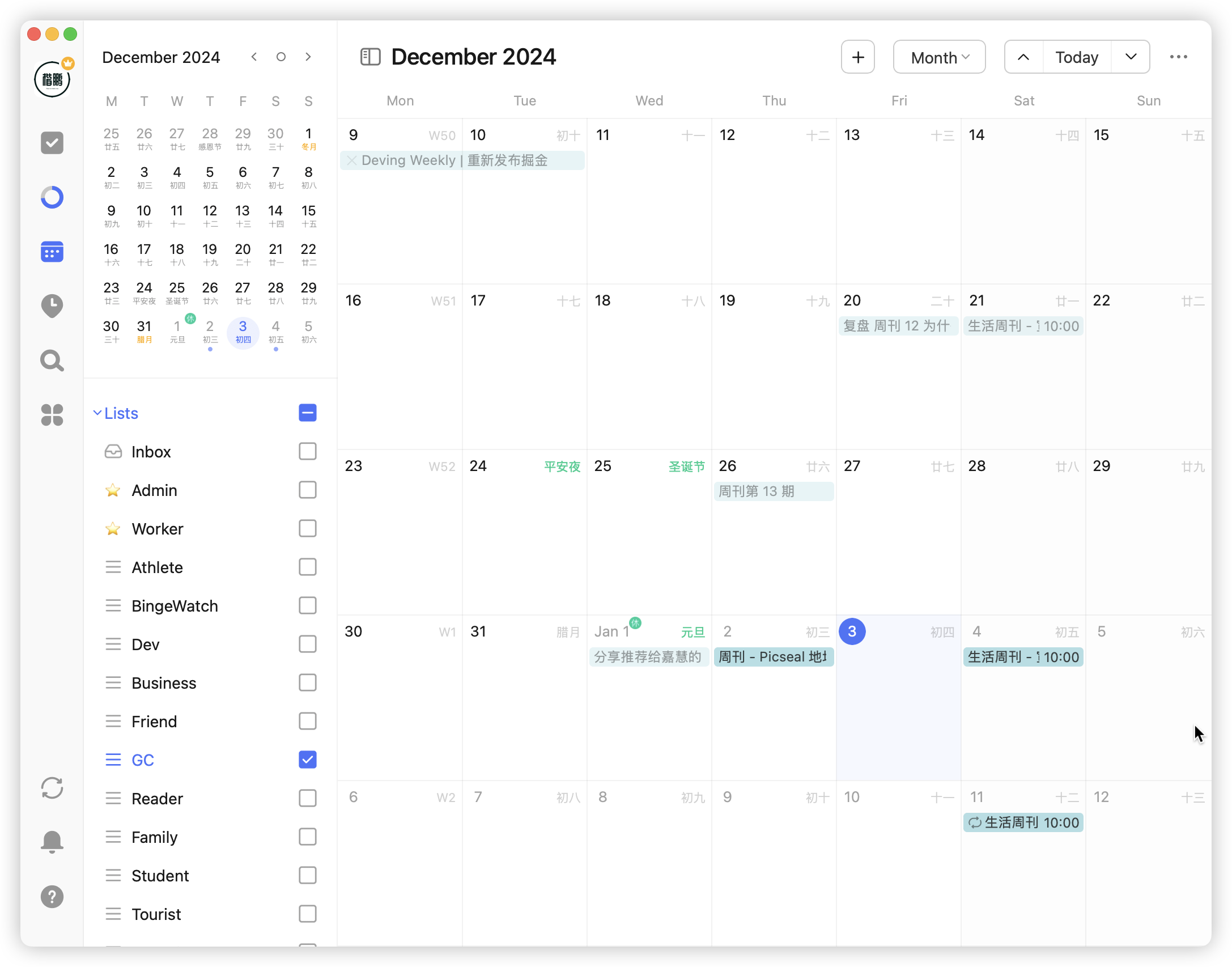
Now using filters by list, tags, etc., you can easily view tasks corresponding to schedules:

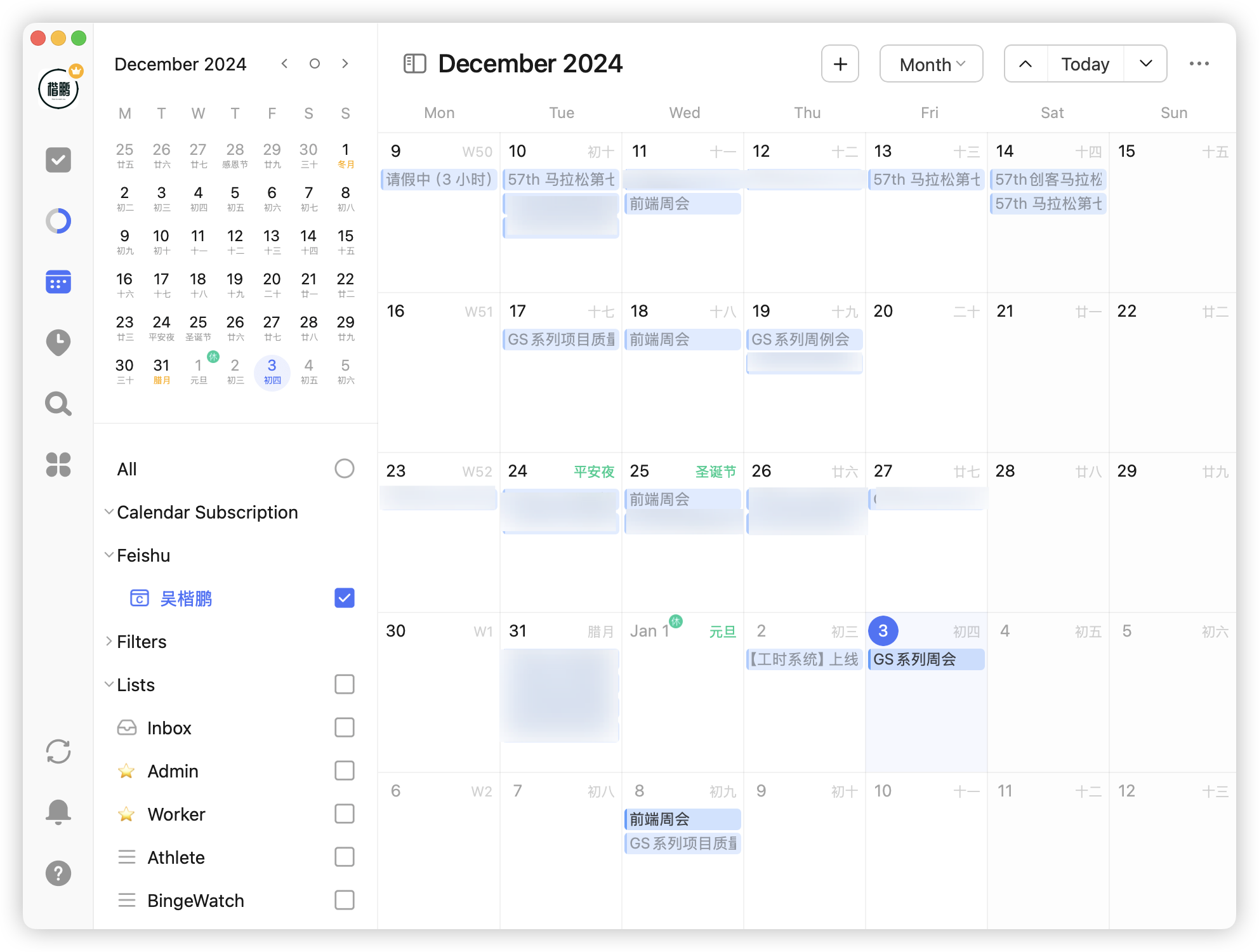
Second discovery: calendars have a universal protocol - CalDAV, a protocol for calendar data sharing and synchronization, applicable to Android, iPhone, Windows, macOS, and all devices. Just need the calendar source to import and sync schedules anywhere.

In TickTick, by importing Feishu's CalDAV configuration, I can subscribe to all Feishu meetings and schedules:

There's also a habit function, for which I discovered three usage methods:

First is the most common positive habits:

Second is bad habits:

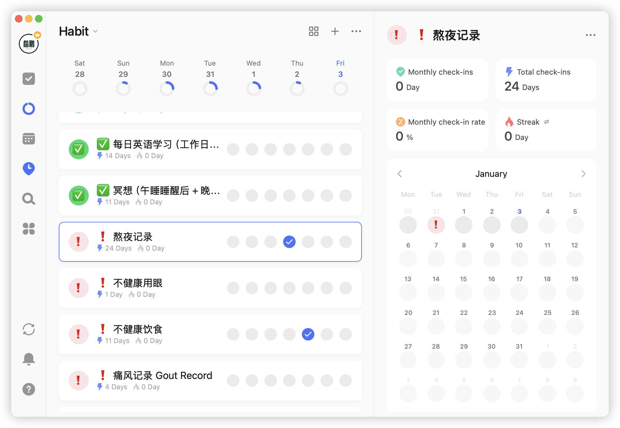
This is opposite to positive habits - only recording when these bad habits occur. Scenarios for recording bad habits include:

  1. Recording low-frequency, occasional bad habits
  2. When successfully cultivated as daily habits, no need for frequent recording, just record exceptions when not done

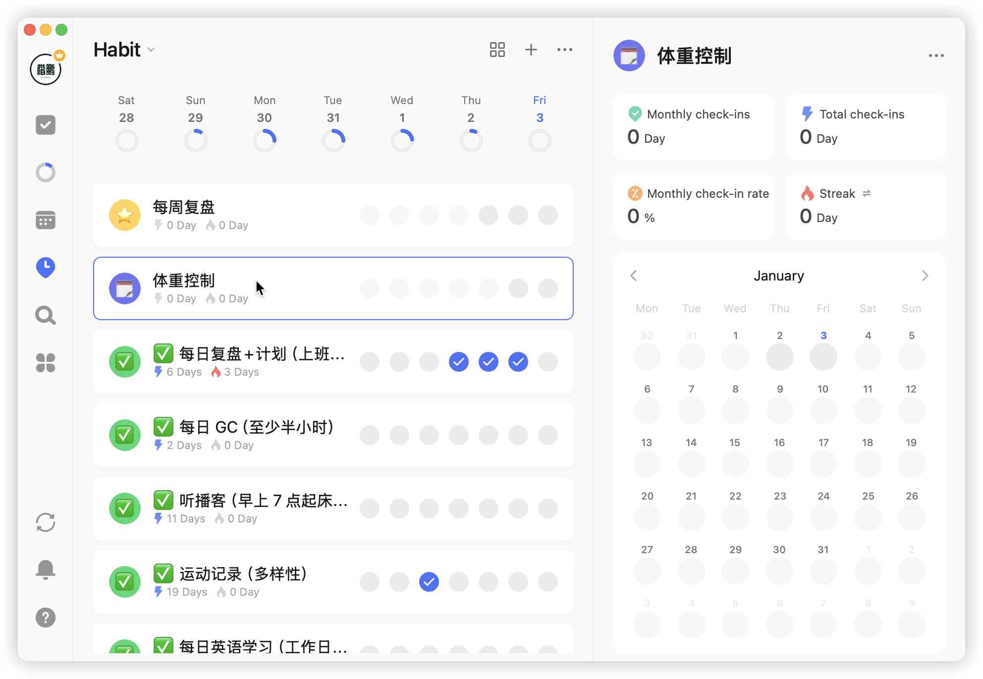
Third is data recording

Habits have built-in calendars, which can be used for data recording. For example, during weight loss, you can record daily weight:

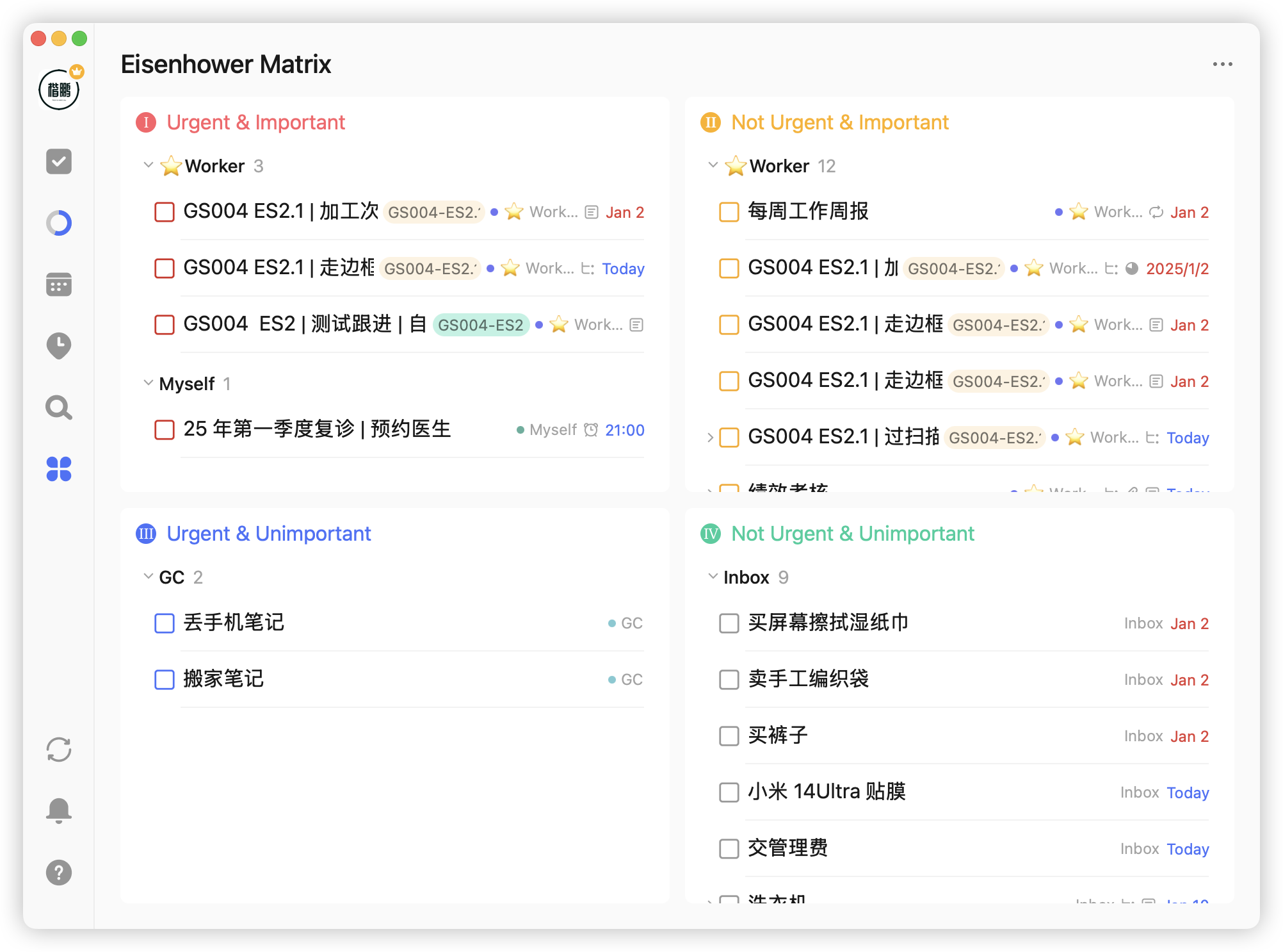
That's my personal use of TickTick over this year. It's indeed excellent software, but undeniably has limitations. For example, the Eisenhower Matrix merely divides tasks by importance and urgency in two dimensions:

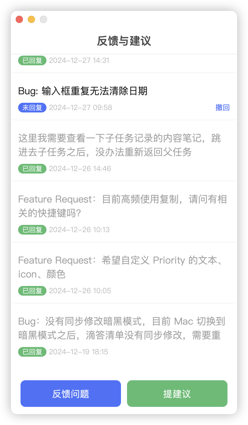
But no software in this world is perfect. When there are problems, solve them. Throughout 2024, I submitted nearly 30 bugs and feature requests to TickTick:

So, does this make me an unofficial tester + product manager? 😆

It's Almost 2025, I Won't Let You Not Know This AI Reading Tool

· 3 min read

Recently, a friend asked me: what software can translate PDF documents into Chinese?

That stumped me for a moment. I usually only use simple Q&A AIs like ChatGPT, Kimi, or Doubao. For actual PDF document translation scenarios, I hadn't encountered that.

In the end, my friend had to pay for it on Xiaohongshu, spending 50 yuan 💰

Because I didn't know how to use AI, I actually missed a money-making opportunity!

Fortunately, I recently discovered an intelligent AI reading assistant called "Baoyue AI".

Testing it with a PDF document, the translation results were quite impressive:

Not only that, clicking to generate a mind map, a clearly structured mind map appears beautifully:

Moreover, Baoyue AI also automatically generated a summary:

Besides PDF documents, it also supports word, ppt, epub, mobi, txt, markdown, jpg/png, webp, wps, caj, and even video and audio files.

To help me read documents easily, Baoyue AI really went the extra mile.

Baoyue has a deep understanding of current AI large language model capabilities.

Current large models are actually not good at generating information - asking them to write articles just results in repetitive content going in circles.

But when it comes to deconstructing and understanding information, they excel.

Baoyue leverages AI's strengths, maximizing the advantages in deconstructing and understanding information.

In terms of specific product implementation, Baoyue does several things:

First, through easy-to-understand "reading scenarios" categorization, letting users quickly match their needs.

Current scenarios include academic papers, contracts, office work, self-media, teaching assistant, books, official documents, technical R&D, etc., meeting most requirements.

For example, recently while learning Coco's "CSS Technology Decryption and Practical Mastery", I used "Technical R&D > Line-by-line Code Explanation".

Line-by-line explanation of all CSS code properties, learning efficiency Max 💪

Second is rich information processing methods - it's not just a chatbot.

For example, using the "Self-media > Tech News Deep Reading" scenario, I had Baoyue analyze this article "Can Zed Beat VS Code?"

Besides the mind map mentioned earlier, there's also an introduction to help users quickly understand the article's core points, as well as rewriting features for secondary creation and more.

Third is adding "AI Search" to let users connect to more related information - external enhancement.

Fourth is having "note-taking capabilities", allowing users to record their divergent thoughts - internal enhancement.

Through this four-in-one approach, closing the entire loop from need identification, information processing, information expansion, to information digestion, perfectly solving reading scenarios.

I sincerely hope that domestic companies developing AI applications can be like Baoyue AI, truly focusing on and perfecting a vertical scenario, improving efficiency and saving time for users, creating real value.

👉 Baoyue AI official website: baoyueai.com

Amazing Uses of Mac Notes App

· 3 min read

Previously when using Windows, the most painful thing was not having an app that could satisfy my need for quick note-taking.

Most apps required opening the note software first, then creating a new note, and finally typing - too many steps and too cumbersome.

After switching to macOS, what surprised me was the built-in Notes app. Just simply move your mouse to the bottom right corner of the screen to create a Quick Note.

Amazing!

This method is called Hot Corners, which can be set in "System Settings » Desktop & Dock » Hot Corners":

The four hot corners can be freely configured:

Besides hot corners, the keyboard shortcut fn(🌐) + Q can also create a Quick Note.

There's another issue - hot corners or shortcuts will open the last edited note by default. If you want to create a new Quick Note every time, you can change the setting here:

Uncheck "Always resume last Quick Note".

Notes supports most frequently used text styles. After selecting text, you can modify styles from the Aa button in the top navigation bar:

It also supports checklists:

The table function is quite basic - just a simple table without advanced features like merging or freezing.

There are also images and links, which I won't elaborate on here.

Notes supports folder categorization by default, and also supports tag categorization. Just use the hashtag (#) followed by text in your note, and Mac will generate the corresponding tag list:

Previously when browsing web pages, I really wanted to highlight certain content and make some extended notes. I installed the Weava Highlighter plugin, but it wasn't user-friendly - Weava would pop up whenever I selected text, which was very annoying.

Surprisingly, Mac Notes natively supports this feature!

In Safari, you can select content you want to save, right-click "Add to Quick Note":

After creating the Quick Note, the selected text will be highlighted in Safari:

In the latest macOS 15 update, Notes now supports audio recording:

It also supports real-time speech-to-text, but currently it only supports English (again).

Cook's native language is English, mine is speechless 😅

Additionally, there are new highlight colors - purple, pink, orange, mint, and blue. Have to say, these colors are quite nice looking.

The most useful feature has to be the math function.

Just type formulas like (27/3)^2= or 47*96=, and Notes will automatically calculate the result:

It also supports custom variables:

Overall, Mac Notes is a decent note-taking app. While it lacks advanced features like Notion's document structure and block editing, it has native support and can meet the needs for quick note-taking and basic editing.

Practical Interview Preparation Guide for Frontend Developers

· 9 min read

Recently, there's a popular saying: "Good jobs are like HIV, only transmitted through mother-to-child, blood, and sexual contact"

Excluding HIV patients, for programmers from ordinary families, interviews are an inevitable path.

Generally speaking, interviews have four difficulties:

  1. Weak technical skills: Shaky foundation? Unfamiliar with algorithms?
  2. Insufficient projects: No impressive projects? All failed projects?
  3. Poor communication: Can't express yourself? No logic when speaking?
  4. Mindset issues: Anxious about resumes being ignored? Depressed after failing first round? Stressed about resigning without a new job?

These are actually just symptoms. The real root cause is:

Lack of systematic understanding and preparation for interviews

Next, I'll share my personal interview preparation approach from several aspects.

1. Have a Clear Understanding of Yourself

Many people have sky-high ambitions but often paper-thin fate.

Without clear self-awareness and planning, they enter the job market full of ambition, but quickly get slapped by reality.

At the start of interviews, you need to clarify your existing resources. For example, for me:

  • Education: Non-prestigious bachelor's degree
  • Technical skills: Average foundation, no algorithm knowledge
  • Work experience: Never worked at a major tech company
  • Projects: No medium or large-scale project experience

These are my disadvantages in interviews. So what are my advantages:

  • Young and affordable, three years of work experience with some project experience, good value for companies
  • Some writing achievements, maintaining a personal technical blog
  • Open mindset, willing to learn and try new things

After comprehensively analyzing my resources, my conclusion was:

  • I have some market competitiveness, but haven't reached the threshold for major tech companies yet. Can try for mid-tier companies
  • Second-best outcome would be small companies or startups
  • Worst case would be subsidiaries of major companies, outsourcing companies, or Huawei OD

2. Prepare Well for a Protracted Battle

Interviews are like warfare, and it's a protracted battle.

Money

First is the financial aspect, especially if you resign without a new job - do you have enough savings to support yourself?

Don't expect to find a satisfactory job in one or two months - that's unrealistic.

Especially in the current environment, plan for at least 6+ months of savings.

Downgrade consumption where necessary, save where you can.

Mindset

Second is mindset. Most people start job hunting full of confidence.

But as time passes, with no responses to resumes, failed interviews, and concerned inquiries from family and friends, pressure builds.

It's easy to become anxious or even depressed. I've experienced this too.

My approach is to document it - accept your emotions and give yourself positive psychological reinforcement.

As Professor Luo Xiang once said: For uncontrollable things, we should remain optimistic; for controllable things, we should remain cautious.

Physical Strength

Finally, physical strength. Since job hunting is a protracted battle, you need sufficient physical stamina.

Staying at home browsing job sites, mass applying without results, constant rejections - under this double drain of mental and physical energy, people easily break down.

Better to go out for walks, breathe fresh air, do some exercise.

Maintaining healthy body and mind actually helps maintain confidence and improve job search efficiency.

3. Tools for Efficiency

During this preparation, I mainly used these tools:

Flomo

Flomo is a "simple, efficient" fragment note-taking tool that helps you record, organize, and review your preparation process.

In Flomo, I mainly recorded my interview experiences, questions, feelings, reflections, etc.

Feishu

Feishu supports personal version, and I mainly used "Feishu Docs" and "Feishu Minutes" for preparation.

First, Feishu Docs is really great - rich document types, block documents like Notion, plus mind maps, Base tables, canvases, etc.

I created a ✨ Frontend Job Hunting Guide with Feishu Docs, which I'll mention in the next section.

For Feishu Minutes, you can upload audio MP3s and convert them to text - mainly used for post-interview self-review.

You can click on text to jump directly to the corresponding audio position - very convenient, with features like speed control and skip silence.

If you haven't used Feishu yet 👉 Try Feishu

TickTick

TickTick is a task management tool, mainly used for preparation planning.

TickTick also has a nice Pomodoro focus feature for tracking daily task progress and status.

If you haven't used TickTick yet 👉 Try TickTick

AI Tools

I have to admit, AI tools are really effective now.

I originally wanted to pay for guidance from seniors, but AI tools can achieve good results for free.

  • ChatGPT, Claude: Good answer quality, but requires VPN 🪜

  • Doubao: ByteDance's AI Q&A product. For non-technical questions, answer quality matches ChatGPT, supports PC client. My favorite feature is keyboard shortcuts like Spotlight - directly ask AI questions.

  • Tencent Yuanbao: Average answer quality, but can search WeChat articles before answering - after all, high-quality Chinese content is trapped in WeChat's closed platform.

4. Create Your Personal Job Hunting Guide

I believe every job-seeking programmer should create a personal job hunting guide.

Why Create a Job Hunting Guide

The reason is simple - systematize the preparation process, consolidating preparation strategies, job search records, interview questions, and processes into one knowledge base.

Beyond this interview, your job hunting guide can be used for the next one - current efforts are reinforcing your future self.

I chose Feishu Docs because it's quite powerful and mind maps are free to use.

Of course, use whatever note-taking app you're familiar with - Yuque, Notion, Obsidian, even Word or Excel work.

Software tools are just means - what matters is your thinking and documentation.

Job Hunting Guide Reference Content

My Feishu document ✨ Frontend Job Hunting Guide is now public - feel free to reference it.

First is the "Complete Guide" section, arranged by job search timeline, covering various aspects of job hunting.

If that's too much, just check the "Lite Quick Guide".

Next is "Assignment 1: PDCJ" - for periodic review I use PDCJ, a thinking model:

  • P is Plan
  • D is Do
  • C is Check
  • J is Just (adjust)

Through periodic planning and implementation, then continuous checking and adjusting, ensure your interviews proceed correctly and efficiently without derailing.

"Assignment 2: Interview Questions" is quite important. Beyond technical knowledge, deeply explore your own projects.

Not just successful projects - explore failed ones too, showing interviewers your deep, multi-angle thinking about projects.

Then "Assignment 3: Personalized Self-Introduction" - this is showing yourself.

In interviews, self-introduction is one of the most important parts, giving interviewers an initial impression of you.

Though it depends on the interviewer - some may not like opening "self-introductions", preferring direct questions like "Tell me about your most fulfilling project".

For "Assignment 4: Company Tracking Sheet", maintain all your application statuses including company name, position, application time, interview status, etc.

There are many job search channels for programmers now. This sheet helps maintain your job search status for coordination and timely follow-up.

As this data grows, you can analyze your application efficiency - for example, referral resume pass rates are much higher than Boss Zhipin applications, allowing you to adjust your job search strategy.

5. Some Final Tips

1. Don't Deny Yourself

Exams fail, relationships end, interviews bomb - these are all normal.

Failure is the norm in life, success is rare.

Don't rush to deny yourself because of interview failures.

If you fail, review, reflect, summarize, and try again (PDCJ).

Here's a quote I really like:

2. Be Humble

Schopenhauer said: Everyone takes the limits of their own vision as the limits of the world.

A frog at the bottom of a well thinks the world is limited to that well.

I've made this mistake before, thinking I was great, but the deeper I learn, the more I realize my insignificance and ignorance.

Now in interviews, I maintain a humble attitude.

When encountering my strong areas, explain eloquently, showing your abilities and thinking.

When encountering weak areas, honestly admit it and express willingness to learn and improve.

3. About Outsourcing Companies

For outsourcing companies - avoid if possible.

Compensation-wise, salaries and bonuses are reduced after the outsourcing company takes its cut.

Work content is often maintenance, secondary development, testing, and other miscellaneous tasks.

Technically, outsourcing companies often have poor technical culture, with colleagues likely lying flat.

Self-esteem wise, outsourced employees are often second-class citizens - internal network permissions, badges, meal cards all remind you of the gap with regular employees.

So unless it's transitional (1-2 years), outsourcing companies aren't recommended.

Also, don't use outsourcing positions for interview practice.

Outsourcing interview questions, difficulty, and interviewer mindset differ from regular positions - little reference value.

Plus it requires significant time and energy - coordinating with HR, scheduling tests, interviews, commuting to on-site interviews, etc.

No need for this useless work - save energy for regular position interviews.

On Boss Zhipin, go to Settings > Privacy > Block Companies to block outsourcing companies and avoid interference.

4. Use Everything You Can

I've heard that the entrepreneurial state is "courtesan mentality, widow treatment, women's federation pursuit".

This applies to job hunting too.

Your pursuit and goal is finding a satisfactory job, so lower your pride and use all available resources.

Contact your friend circles, classmate circles, former colleagues one by one - ask about referral opportunities.

Email experts to ask about suitable positions or interview advice.

Join tech groups, QQ groups, WeChat groups - communicate with experts and peers.

Expand your job search scope - don't limit yourself to Boss Zhipin, Lagou, Liepin, and other job sites.

About to Leave My Job, Recording the Mac Apps I Use

· 6 min read

General Purpose

Feishu

Believe it or not, the first recommendation is Feishu. It's the most comfortable project management application I've used.

Just Feishu Docs alone, its features and experience far exceed Tencent Docs, Shimo Docs, Yuque, and others on the market.

Now Feishu also supports personal version, no more thumbs up needed.

Besides documents, Feishu also supports email, video calls, and other features. Feishu = Enterprise WeChat + Tencent Docs + QQ Mail + Tencent Meeting, truly All in One.

Feishu also has some thoughtful small features, like OCR (image to text), video recording, GIF recording, and a very practical "scrolling screenshot" - no more worries about long screenshots.

Arc

My main browser has switched from Chrome to Arc. Arc's multiple spaces solve my long-standing pain point.

It also automatically collapses expired tabs, supports full screen, looks beautiful, and has comfortable interactions. Arc is worth having.

Youdao Translate

For programmers reading official technical documentation, translation is a must.

I'm a long-time user of Youdao Translate, accompanying it from Youdao Dictionary to its current name Youdao Translate.

Although Youdao's translation quality isn't the best, it wins with its rich dictionary content and convenient hover translation.

Now with AI added, translation quality has improved significantly. Got myself a two-year membership.

Grammarly Desktop

When submitting issues or writing in English, worried about grammar mistakes? Grammarly Desktop comes in handy.

Basic grammar checking is free, but polishing and AI features require payment.

iBar

My Mac has a notch screen. When there are too many apps, they get hidden by the notch, which is annoying.

iBar can collapse the menu bar.

iShot

To capture beautiful screenshots with rounded corners and shadows, use iShot.

The free version is sufficient. Advanced paid features like long screenshots, OCR, and screen recording can be done with Feishu's built-in tools.

Snipaste

When I switched from Windows to Mac, I continued using Snipaste. Its pin image feature is very useful.

App Cleaner & Uninstaller

App Cleaner & Uninstaller for thorough app uninstallation, clean and complete.

Runcat

Watching a cat constantly running in the menu bar is also a form of entertainment.

Runcat can display current CPU usage in the menu bar. The more CPU is used, the faster the cat runs.

Activate Mac

A boring little widget, similar to Windows' "Activate Windows", displays "Activate macOS" in the bottom right corner of the screen.

Productivity

Personal Task Management Trio

  1. TickTick: Task planning and scheduled tasks

  1. Flomo: Recording inspiration, reviewing task processes or results

  1. FlowUs: Review output, reading notes

Why choose this toolkit?

  1. All are domestic applications, no VPN needed, avoiding anxious moments during network fluctuations
  2. Cross-platform support: mobile, PC, web, mini-programs - full coverage
  3. Good to use, replacing Todoist, Notion, etc.

Revezone

I often need to draw flowcharts and use Excalidraw for doodle-style drawings, but unfortunately it doesn't support Chinese fonts.

Revezone is like a localized version of Excalidraw, but goes further, integrating Tldraw, Notion-like note features, and providing a Mac client.

Currently open source and free, in alpha testing phase, worth trying.

Screen Recording

  1. OBS: Professional recording. Choose this for heavy-duty needs like course recording. For lightweight recording, use Feishu's GIF recording.

  1. Screen Studio: Can create very smooth operation videos

  1. KeyCastr: Shows pressed keys, open source and free

uTools

Truly a new generation efficiency tool platform. Everything is a plugin - whatever small feature you need can be found here.

Sunflower Remote Desktop

For remote computer access, I recommend Sunflower. The free version basically meets needs, though it pops up small ads.

Development

Fork

A free Git visualization tool, aptly named "Fork".

Warp

A new terminal application supporting basic completion, memory features, plus AI assistance.

Zed

I won't recommend JetBrains, VSCode, etc. - these are already well-known code editors.

I'll recommend Zed, a new generation editor based on Rust with very fast startup and input speed.

Zed is just starting out, worth watching.

Database Visualization

The database visualization king Navicat is familiar to everyone. They finally released a free version called Navicat Premium Lite. As a lite version of Navicat Premium 17, it has all the basic features.

Officially stated: "It meets the basic database management needs of beginners and non-commercial users" (probably because there were too many pirated copies 🤣)

If you only need lightweight database visualization, I recommend SQL Pro Studio.

While not as powerful as Navicat, it's a Mac native app with good performance. Basic operations (filtering, sorting) are covered, advanced features require writing SQL.

For Postgres databases, use Postico 2, specifically for Postgres.

For Redis visualization, I recommend Another Redis Desktop Manager or Redis Insight. Each has pros and cons, can be used together.

Typora & uPic

When writing Markdown notes, Typora has always been my first love.

Typora doesn't support images natively, so I set up an image hosting service on my server, currently using uPic for image uploads.

He3

Developer toolbox, combining multiple development tools, plus some basic video editing, image cropping, audio conversion tools.

Found a Google XSS Vulnerability

· 3 min read

Programmer Matan found an XSS vulnerability and reported it to Google, receiving a reward of $3,133.7 (approximately ¥22,666 RMB).

Here are Google Bug Hunter's reward rules:

👉 Image from https://bughunters.google.com/about/rules/google-friends/6625378258649088/google-and-alphabet-vulnerability-reward-program-vrp-rules

Here's how it started. Matan read an article exposing a Google SSRF vulnerability that mentioned this Google website:

📍 https://toolbox.googleapps.com

So he began exploring, first by checking the robots.txt file:

#apps-toolbox
User-Agent: *
Allow: /apps/main
Allow: /apps/browserinfo
Allow: /apps/checkmx
Allow: /apps/dig
Allow: /apps/har_analyzer
Allow: /apps/loganalyzer
Allow: /apps/loggershark
Allow: /apps/messageheader
Allow: /apps/recovery
Allow: /apps/useragent
Allow: /apps/other_tools
Allow: /apps/encode_decode
Allow: /apps/screen_recorder
Disallow: *

robots.txt is a file at the website's root directory that tells web crawlers which pages can be crawled and which cannot, to avoid the website being overloaded with crawler requests.

In the robots.txt file, each link corresponds to a tool webpage.

But there's one exception: /apps/recovery cannot be accessed directly.

After a simple search, he discovered it has subpages:

recovery/domain_in_use
recovery/form
recovery/ownership

These subpages can all accept multiple URL parameters, for example:

recovery/domain_in_use?visit_id=xxx&user=xxx&domain=xxx&email=xxx

If you enter this continue redirect link:

https://toolbox.googleapps.com/apps/recovery/ownership?domain=example.com&email=email@example.com&case=45500368&continue=/apps/recovery/...

This link contains the parameter domain=example.com, and note there's also a continue=/apps/recovery/... parameter.

Entering this continue redirect link gives a prompt:

Here's where the problem was discovered - the CONTINUE button's link actually comes from the continue parameter!

Matan tested it by injecting JavaScript code: .../continue=javascript:alert(document.domain)

Successfully executed ✅

This website has no CSP security policy and no protective measures, so it can fetch resources from any external source.

He continued trying to load an external malicious script that retrieves the user's IP address:

.../continue=javascript:fetch(%27https://api.ipify.org?format=json%27).then(response=%3Eresponse.text()).then(data=%3E{alert(data);%20})

Also successfully executed ✅

At this point, the XSS vulnerability was confirmed.

Let's review XSS knowledge:

XSS (Cross-Site Scripting), cross-site scripting attack, occurs when validation is not properly done, trusting user input and accepting malicious input from attackers (usually JavaScript code), causing that malicious input to execute on other users' pages. XSS is generally divided into three types:

  1. Stored: Malicious input is permanently stored in the backend service. Whenever users open the website and retrieve that malicious input, the browser executes it.
  2. Reflected: Malicious input is embedded in URLs or other inputs and immediately forwarded by the backend. As long as users visit the crafted URL, the browser executes it.
  3. DOM-based: Attackers manipulate the user's DOM structure to execute malicious code.

Matan's example above is a typical reflected XSS.

But this XSS is so basic that even Matan himself found it hard to believe, especially since Google's technology is famously good in the industry.

However, Google habitually uses their own frameworks, and when these frameworks don't implement proper security policies, product failures are inevitable.