PART1 REVIEWING THE FUNDAMENTALS
1 Cascade, specificity, and inheritance
CSS is not a programming language.
1.1 The cascade
Basically, CSS is about declaring rules.
The code of CSS is becoming complex as project growing. To accomplish same thing we can use multiple way. So the key part of CSS development comes down to writing rules in such a way that they're predictable.
Example:
-
HTML
<!DOCTYPE html>
<html lang="en">
<head>
    <link rel="stylesheet" href="./style.css">
    <title>Document</title>
</head>
<body>
    <header class="page-header">
        <h1 id="page-title" class="title">Wombat Coffee Roasters</h1>
        <nav>
            <ul id="main-nav" class="nav">
                <li><a href="/">Home</a></li>
                <li><a href="/coffees">Coffees</a></li>
                <li><a href="/brewers">Brewers</a></li>
                <li><a href="/specials" class="featured">Specials</a></li>
            </ul>
        </nav>
    </header>
</body>
</html> -
CSS
h1 {
    font-family: serif;
}

#page-title {
    font-family: sans-serif;
}

.title {
    font-family: monospace;
}
There are conflicting declaration for <h1> tag.
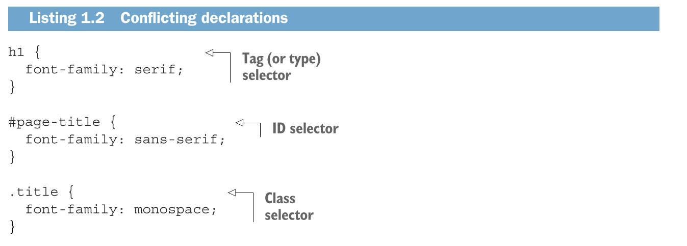
When declarations conflict, cascade consider three things:
-
Stylesheet origin where the stylesheet come from?
-
Selector specificity which selector take precedence over which.
-
Source order order in which styles are declared in the stylesheet.
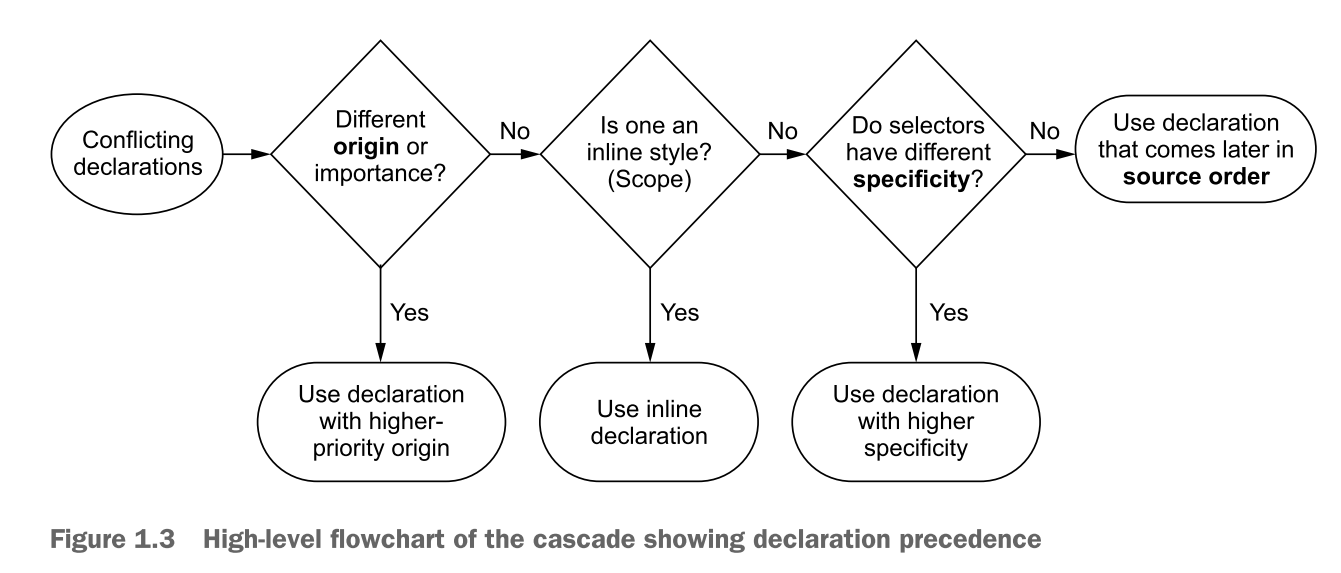
A quick review of terminology:
declaration a line of CSS code composed by a property and a value:
color: black;declaration block: multiple declaration within a pair of curly brace:
{
    color: black;
    font-family: Helvetica;
}selector: prior to declaration block.
body {
    //...
}ruleset: selector + declaration block, concisely call "rule".
body {
    color: black;
    font-family: Helvetica;
}at-rules: language constructs beginning with an "at" symbol, such as
@importrules or@mediaqueries.
1.1.1 Understanding stylesheet origin
Type, or origin of stylesheet:
-
author styles: write by developer.
-
user agent styles: browser default style which priority lower than author style.
User agent can custom but it is rarely used and beyond your control.
USER AGENT STYLES
Besides author styles, other styles will apply user agent styles.
IMPORTANT DECLARATIONS
!important mark the style is higher-priority.
color: red !important;
So the order:
- author-important
- author
- user agent
💡 The cascade independently resolves conflicts for every property of element. So you set the bold font, but will not effect margin or other properties.
1.1.2 Understanding specificity
specificity:
- inline style
- selector
INLINE STYLES
<a href="/specials" class="featured" style="background-color: orange">Specials</a>
To override the inline styles, we can using importance to the declaration:
.featured {
    background-color: red !important;
}
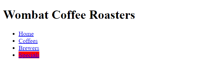
There are nothing happen if using !importance in inline style:
<a href="/specials" class="featured" style="background-color: orange !important">Specials</a>
SELECTOR SPECIFICITY
<!DOCTYPE html>
<html lang="en">
<body>
    <header class="page-header">
        <h1 id="page-title" class="title">Wombat Coffee Roasters</h1>
    </header>
</body>
</html>
html body header h1 { // Four tags
    color: blue;
}

body header .page-header h1 { // One class + three tags
    color: orange;
}

.page-header .title { // Two classes
    color: green
}

#page-title { // One ID
    color: red;
}
👋 Pseudo-class selectors and attribute selectors have the same specificity as a class selector.
👋 The universal selector(*) and combinators(>, +, -) have no effect on specificity.
There no effect happen probably since the declaration didn't overtake other specific rule.
A NOTATION FRO SPECIFICITY
| Selector | IDs | Classes | Tags | Notation |
|---|---|---|---|---|
html body header h1 | 0 | 0 | 4 | 0, 0, 4 |
body header .page-header h1 | 0 | 1 | 3 | 0, 1, 3 |
.page-header .title | 0 | 2 | 0 | 0, 2, 0 |
#page-title | 1 | 0 | 0 | 1, 0, 0 |
1.1.3 Understanding source order
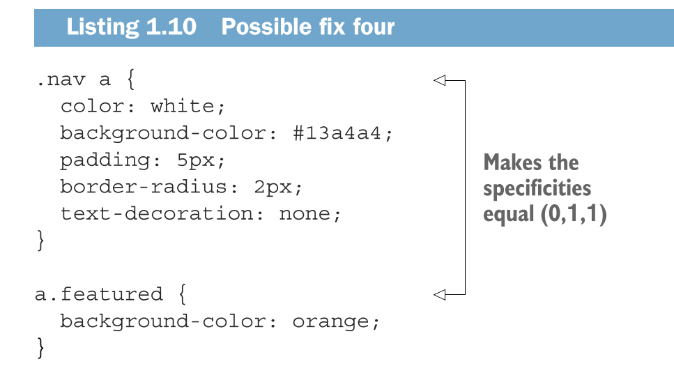
If the origin and specificity are the same, later win!
1.1.4 Two rules of thumb
- Don't use ID selector
- Don't use
!importance
1.2 Inheritance
The last way to receive the style for the element: Inheritance
Only some style will be inherited:
- text:
color,font,font-family,font-size,font-weight,font-variant,font-style,line-height,letter-spacing,text-align,text-indent,white-space,word-space - list:
list-style,list-style-type,list-style-position,list-style-image - table:
border-collapse,border-spacing - other...
🚀 Use your DevTools!
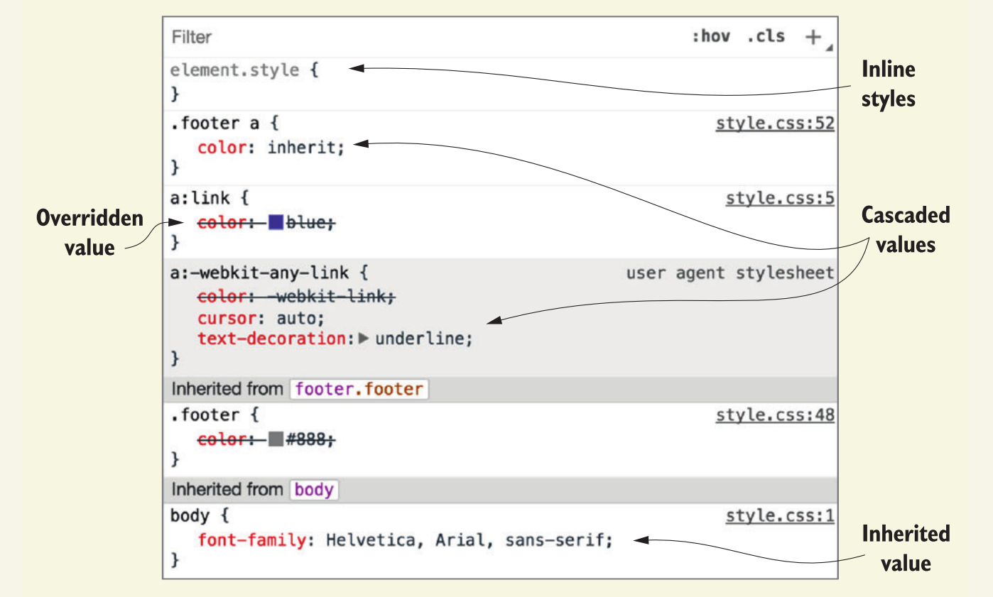
1.3 Special Values
Two special Values applying in any property to help manipulate cascade:
- inherit
- initial
1.3.1 Using the inherit keyword
inherit To inherit the declaration from its parent.
Implement the footer:

    <footer class="footer">
        © 2016 Wombat Coffee Roasters —
        <a href="/">Term of use</a>
    </footer>
a:link {
    /*Global link color for the page*/
    color: blue;
}

.footer {
    color: #666;
    background-color: #ccc;
    padding: 15px 0;
    text-align: center;
    font-size: 14px;
}

.footer a {
    color: inherit; /* Inherit from parent to override global link style*/
    text-decoration: underline;
}
1.3.2 Using the initial value
initial Set the property to its initial value.
Set the property but not the element. For example,
display: initialequal todisplay: inlineregardless of what type of element element apply it to.
1.4 Shorthand properties
Shorthand properties set the several value at one time:
font: italic bold 18px/1.2 "helvetica", "Arial", sans-serif;
1.4.1 Beware shorthand silently overriding other styles
<h1 class="title">Wombat Coffee Roasters</h1>
h1 {
    font-weight: bold;
}

When using font shorthand:
.title {
    font: 32px Helvetica, Arial, sans-serif;
}

Shorthand silently override the other value:
h1 {
    font-weight: bold;
}

/* Equivalent Code*/
.title {
    font-style: normal;
    font-variant: normal;
    font-weight: normal;
    font-stretch: normal;
    line-height: normal;
    font-size: 32px;
    font-family: Helvetica, Arial, sans-serif;
}
1.4.2 Understanding the order of shorthand values
TOP, RIGHT, BOTTOM, LEFT
padding: 1em 2em 1em
How to remember the three value given?
It surely consist of Top-Right-Bottom-Left, and left value is miss so its value will equal right:
padding: 1em 2em 1em (2em)
HORIZONTAL, VERTICAL
Two value represent Cartesian grid: x for horizontal and y for vertical:
#main-nav a {
    color: white;
    background-color: #13a4a4 !important;
    padding: 5px;
    border-radius: 2px;
    text-decoration: none;
    box-shadow: 10px 20px #6f9090; /* Shadow offset 10px to the right and 2px down*/
}

2 Working with relative units
2.1 The power of relative values
Relative unit: late-binding — the content and its style aren't pulled together until after the authoring of both is complete.
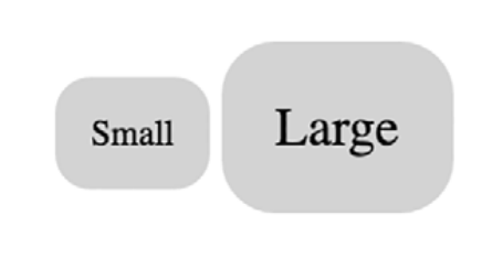
2.2 Ems and rems
em: multiple by the font-size
<span class="box box-small">Small</span>
<span class="box box-large">Large</span>
.box {
    padding: 1em;
    border-radius: 1em;
    background-color: lightgray;
}

.box-small {
    font-size: 12px;
}

.box-large {
    font-size: 18px;
}
2.2.1 Using ems to define font-size
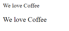
<body>
    We love Coffee
    <p class="slogan">We love Coffee</p>
</body>
body {
    font-size: 16px;
}

.slogan {
    font-size: 1.2em; /* Inherit from body*/
}
If font-size equal 16px, your want 12px, the value of ems is :12/16=0.75em
If font-size equal 16px, your want 18px, the value of ems is :18/16=1.125em
EMS FOR FONT SIZE TOGETHER WITH EMS FOR OTHER PROPERTIES
<body>
    We love Coffee
    <p class="slogan">We love Coffee</p>
</body>
<style>
    body {
        font-size: 16px;
    }

    .slogan {
        font-size: 1.2em; /* Calculate : 16px * 1.2 = 19.2px */
        padding: 1.2em; /* Calculate: 19.2px * 1.2 = 23.04px */
        background-color: gray;
    }
</style>

Element will calculate the value of font-size and uses that value for other properties.
THE SHRINKING FONT PROBLEM

<body>
    <ul>
        <li>Top Level</li>
        <ul>
            <li>Second Level</li>
            <ul>
                <li>Third Level</li>
                <ul>
                    <li>Fourth Level</li>
                    <ul>
                        <li>Fifth Level</li>
                    </ul>
                </ul>
            </ul>
        </ul>
    </ul>
</body>
<style>
    body {
        font-size: 16px;
    }

    ul {
        font-size: .8em;
    }
</style>
2.2.2 Using rems for font-size
<body>
    <ul>
        <li>Top Level</li>
        <ul>
            <li>Second Level</li>
            <ul>
                <li>Third Level</li>
                <ul>
                    <li>Fourth Level</li>
                    <ul>
                        <li>Fifth Level</li>
                    </ul>
                </ul>
            </ul>
        </ul>
    </ul>
</body>
<style>
    :root {
        font-size: 1em;
    }

    ul {
        font-size: .8rem;
    }
</style>
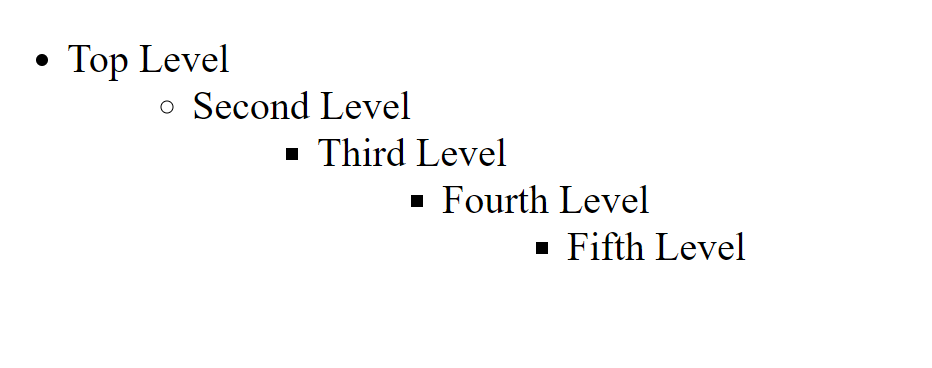
Pseudo-class:root selector is identical to html tag selector except that has higher specificity.
Suggestion:
- Rem for font-size
- Pixel for border
- Em for most properties
2.3 Stop thinking in pixel
2.3.1 Setting a sane default font size
    <div class="panel">
        <h2>Single-origin</h2>
        <div class="panel-body">
            We have built partnerships with small farms around the world to hand-select beans at the peak of season. We then carefully roast in small batches to maximize their potential.
        </div>
    </div>
.panel {
    padding: 1em;
    border-radius: 0.5em;
    border: 1px solid #999;
}

.panel>h2 {
    margin-top: 0;
    font-size: 0.8rem;
    font-weight: bold;
    text-transform: uppercase;
}


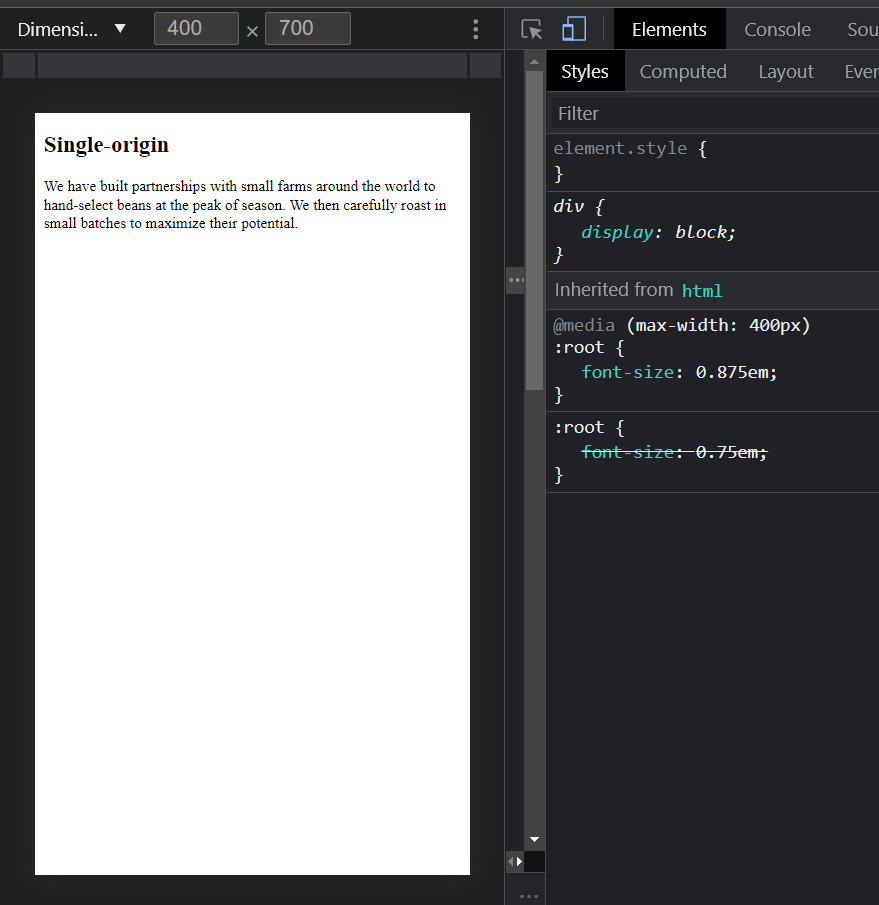
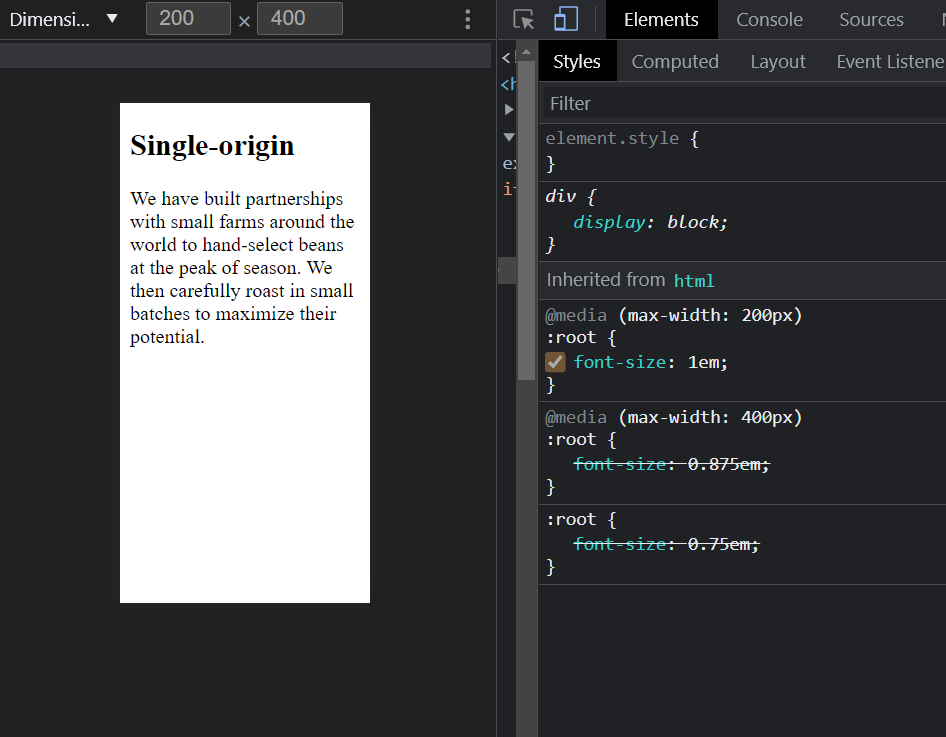
2.3.2 Making the panel responsive
<body>
    <div class="panel">
        <h2>Single-origin</h2>
        <div class="panel-body">
            We have built partnerships with small farms around the world to hand-select beans at the peak of season. We then carefully roast in small batches to maximize their potential.
        </div>
    </div>
</body>
:root {
    font-size: 0.75em;
}

@media(max-width: 400px) {
    :root {
        font-size: 0.875em;
    }
}

@media(max-width: 200px) {
    :root {
        font-size: 1em;
    }
}

2.4 Viewport-relative units
vhvwvmintake the small dimension. landscape->height, portrait->widthvmax
2.4.1 Using vw for font size
font-size: 2vw- 1200px => 24px
- 768px=>15px
Advantages: smoothly change
Disadvantages: the font size it to small for iphone6(375*667) as to big for desktop.
2.4.2 Using calc() for font size
font-size: calc(0.5em + 1vw);- 1200px => 16 * 0.5 + 1200 * 0.01 = 20px
- 375px => 16 * 0.5 + 375 * 0.01 = 11.75px
2.5 Unitless numbers and line-height
Line-height is special: unitless and unit are different.
<body>
    <p class="about-us">
        We have built partnerships with small farms around the world to hand-select beans at the peak of season. We then carefully roast in small batches to maximize thier potential.
    </p>
</body>
    <style>
        body {
            line-height: 1.2;
        }

        .about-us {
            font-size: 2em;
        }
    </style>
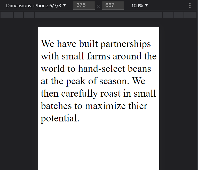
- First:
font-size: 16px * 2 = 32px (Browser default font-size is 16px) - Second:
lint-height: 32px * 1.2 = 38.4px
    <style>
        body {
            /* line-height: 1.2; */
            line-height: 1.2em;
        }

        .about-us {
            font-size: 2em;
        }
    </style>
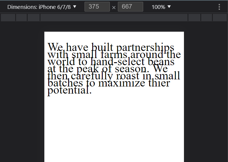
line-height: 16px * 1.2 = 19.2px
2.6 Custom properties (aka CSS variable)
Custom properties: using double hyphens and var(--custome-property) to reference.
var(--custom-property, fallback-value): accept second parameter as fallback value.
<body>
    <p>
        We have built partnerships with small farms around the world to hand-select beans at the peak of season. We then carefully roast in small batches to maximize thier potential.
    </p>
</body>
<style>
    :root {
        --main-font: Helvetica, Arial, sans-serif;
    }

    p {
        font-family: var(--main-font, sans-serif);
        color: var(--secondary-color, blue)
    }
</style>

2.6.1 Changing custom properties dynamically
<body>
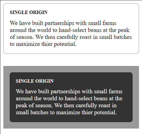
    <div class="panel">
        <h2>Single Origin</h2>
        <div class="body">
            We have built partnerships with small farms around the world to hand-select beans at the peak of season. We then carefully roast in small batches to maximize thier potential.
        </div>
    </div>
    <aside class="dark">
        <div class="panel">
            <h2>Single Origin</h2>
            <div class="body">
                We have built partnerships with small farms around the world to hand-select beans at the peak of season. We then carefully roast in small batches to maximize thier potential.
            </div>
        </div>
    </aside>
</body>
<style>
        :root {
        --main-bg: #fff;
        --main-color: #000;
    }

    .panel {
        font-size: 1rem;
        padding: 1em;
        border: 1px solid #999;
        border-radius: 0.5em;
        background-color: var(--main-bg);
        color: var(--main-color);
    }

    .panel>h2 {
        margin-top: 0;
        font-size: 0.8em;
        font-weight: bold;
        text-transform: uppercase;
    }

    .dark {
        margin-top: 2em;
        padding: 1em;
        background-color: #999;
        --main-bg: #333;
        --main-color: #fff;
    }
</style>
3 Mastering the box model
This chapter covers
- Practical advice for element sizing
- Vertical centering
- Columns of equal height
- Negative margins and margin collaspsing
- Consistent spacing of components on the page
3.1 Difficulties with element width
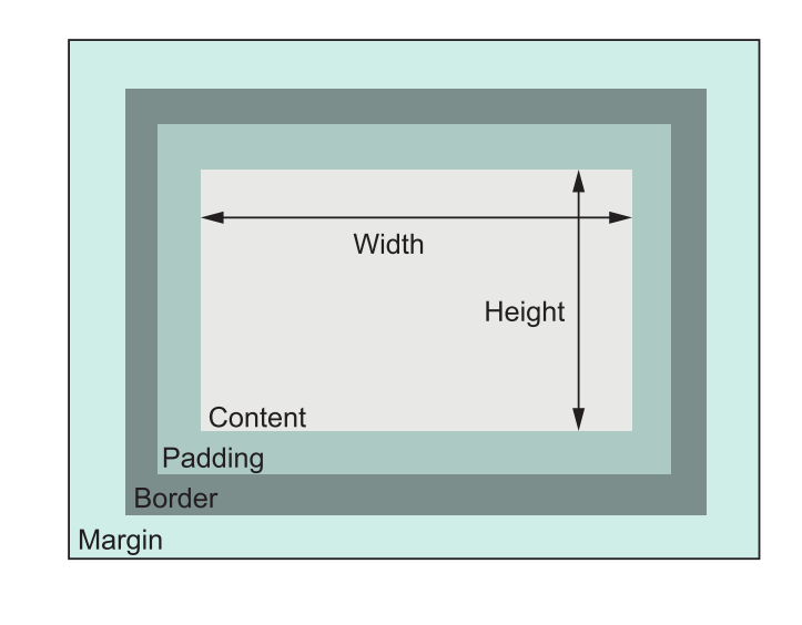
Default box model (also call W3C box model):
box-sizing: border-box to adjust the box model:
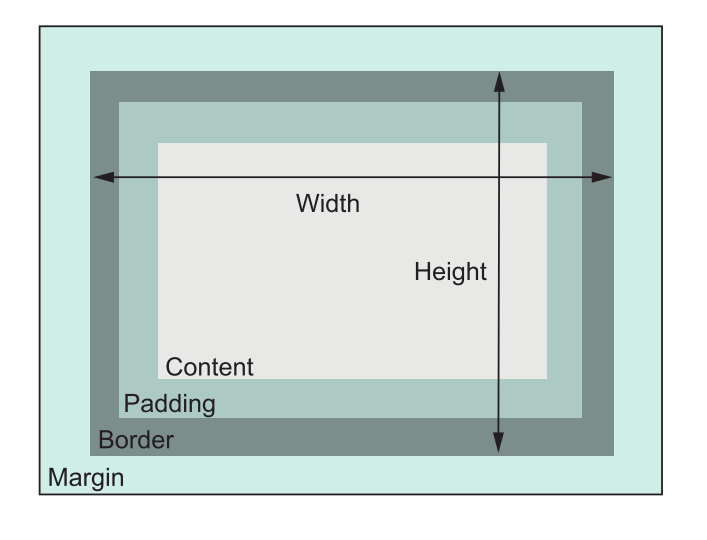
This box model is also call "Internet Explorer box mode"
The Internet Explorer box mode in quirk mode includes border, padding, content within a specified width or height.
IE version 6 and onward have change to W3C box mode. But Quirk mode will still be trigged:
- When the document type declaration is absent or incomplete;
- When an HTML 3 or earlier document is encountered;
- When an HTML 4.0 Transitional or Frameset document type declaration is used and a system identifier (URI) is not present;
- When an SGML comment or other unrecognized content appears before the document type declaration;
- Internet Explorer 6 also uses quirks mode if there is an XML declaration prior to the document type declaration.
3.2 Difficulties with element heigth 🔴
⚔ It's best way to avoid explicitly setting the height. Normal document flow is designed to work with a constrained width and an unlimited height. Contents fill the width of the viewport and then line wrap as necessary.
Normal document flow refers to the default layout behavior of elements on the page.
- Inline elements flow along with the text of the page, from left to right, line wrapping when they reach the edge of their container.
- Block-level elements fall on individual lines, with a line break above and below.
Most detail can see the post:
🔴
3.2.1 Controlling overflow behavior
overflow
visiblehiddenscrollauto
3.2.2 Applying alternatives to percentage-based heights
Percentage refers to the size of an element's containing block;the height of that container, however, is typically determined by the height of its children. This produces a circular definition that the browser can't resolve, so it'll ignore the declaration.
See the post for more detail about containing block: 习以为常但又不太了解的包含块——如何决定元素的尺寸和位置
COLUMNS OF EQUAL HEIGHT
Columns of equal height have plagued CSS developer from the beginning. They used the table as the alternative in the early 2000s. Now we can using more easy methods:
display: tabledisplay: flex
3.2.3 Using min-height and max-height
min-height: defined the the minimum height.
max-height: defined the maximum height.
3.2.4 Vertically centering content
A vertical-align only apply in inline or table-cell elements.
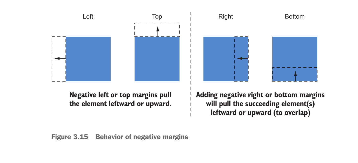
3.3 Negative margins
3.4 Collapsed margins
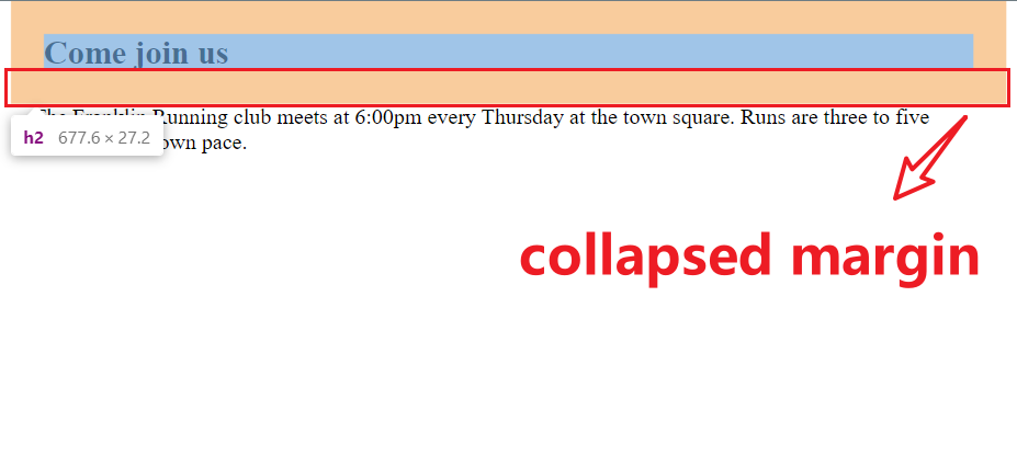
3.4.1 Collapsing between text
The main reason for collapsed margin has to do with the spacing of blocks of text.
<main class="main">
    <h2>Come join us</h2>
    <p>
        The Franklin Running club meets at 6:00pm every Thursday at the town square. Runs are three to five miles, at your own pace.
    </p>
</main>
.main h2 {
    margin: 1em;
}

.main p {
    margin: 1em;
}
3.4.2 Collapsing multiple margins
Elements didn't have to be adjacent siblings for their margins to collapse.
Paragraph wrapped in the <div> have the same effect:
<main class="main">
    <h2>Come join us</h2>
    <div>
        <p>
            The Franklin Running club meets at 6:00pm every Thursday at the town square. Runs are three to five miles, at your own pace.
        </p>
    </div>
</main>
In short, any adjacent top and bottom margins will collapse together.
Good example:
Collapsed margins act as a sort of "personal space bubble." If two people standing at a bus stop are each comfortable with 3 feet of personal space between, they'll happily stand 3 feet apart. They don't need to stand 6 feet apart to both be satisfied.
3.4.3 Collapsing outside the container
The are ways to prevent margins from collapsing:
- Applying
overflow: auto(or any value other than visible) to the container prevents margins inside the container from collapsing with those outside the container. This is often the least intrusive solution. - Adding a border or padding between two margins stops them from collapsing.
- Margins won’t collapse to the outside of a container that is floated, that is an inline block, or that has an absolute or fixed position.
- When using a flexbox, margins won’t collapse between elements that are part of the flex layout. This is also the case with grid layout (chapter 6).
- Elements with a table-cell display don’t have a margin, so they won’t collapse. This also applies to table-row and most other table display types. Exceptions are table, table-inline, and table-caption.
My conclusion: boundary(padding or border or overflow) | float | position | flexbox | grid | table
3.5 Spacing elements within a container
Web designer Heydon Pickering once said margins are “like applying glue to one side of an object before you’ve determined whether you actually want to stick it to something or what that something might be.”
Pickering come up with a item "Lobotomized owl selector": * + * to apply every element whatever they are.
body * + * {
    margin-top: 1.5em;
}
Performance: Modern browser have handled the universal selector performance problem. The era of IE6 when it has incredibly slow performance for tackle with universal selector has gone.